Saturday, January 31, 2015

Finding the right tools for the job - think in ink


Funny story behind this one - I had drawn it originally with a rollerball pen I believe, something with a thin scratchy line anyway - it looked terrible and I felt the need to scribble to build up some boldness. I was getting pissed off and figured I was either going to fix it or destroy it, and my weapon of choice was the black Tombow. I was actually leaning toward destroy, but thought it might be fun to turn it into a coloring book drawing first, with fat unchanging lines everywhere and too-smooth curves. It wasn't until I had drawn both arms that I suddenly noticed I wasn't destroying it - in fact it looked ridiculously good!! Pft wtf- when I try to draw good I suck, but when I try to screw it up I fix it??!! I suppose it's because drawing fat with the Tombow created smooth simple curves, and that's what you're supposed to use for gesture. The crazy part is how many hairy scribbly wrong lines that fat line covers! 


So I decided to do more gesture sketches with it. Timed sketches - something I haven't done in ages now, and I know I need to get back to them. These in an 11 x 14 sketchpad.


I really love the way I can draw with a smooth felt tip brush pen like the Tombow - it has the perfect combination of fast ink flow and control with the ability to go thick or thin at a whim, and the tip isn't too flexible. But I felt like these are a little too bold and black,so for tonight I decided to switch to the Petit3- still my favorite drawing implement, but that I haven't fund the right venue for yet.


I don't know - it's good, but it feels a little thin at times. I seem to have overcome that toward the end - was I holding it on edge? I think so. I also want to try using the small end of the Tombow, and then the big brush tip on newsprint. I have high hopes for both. I suspect when I find exactly the right tool for these gesture I'll bust through to a new level. When the pen actually assists me rather than fighting me it allows me to think in ink - fast and on the fly.

I notice looking back over these though none of the new ones have that fat simplicity of the top one. Must get it back..


I decided to order the female torso sculpture from Phillipe Farout, even though I had looked at it before and decided against it - it's in almost exactly the same pose as the life size plastic mannequin torso, but it has far better definition and you can see the muscles and forms clearly (not TOO clearly). Here's drawing #1 done from it, on newsprint in 6b charcoal pencil. Looking forward to a long and rewarding relationship with it...


And I finally gave in the the temptation to try to draw just like Kevin Chen. In fact I copied some of his stuff. Maybe it'll rub off.. ?

Wednesday, January 28, 2015

reconsidering pens


Knowing what I now know about wet pens and how they behave, and in spite of what I said at the end of the last post about being a dry pen guy, I decided to go back and try a couple of pens I had so to speak written off..

Starting with the above, done with my first fountain pen, the Pen&Ink Sketch Extra Fine. In some ways I like it, it does handle somewhat more like a ballpoint, but I had forgotten how often it stops drawing and needs to be scribble-cleared, fussed with, de-clogged, and occasionally opened up and checked. I notice in spite of all this high-mainteneance gobbldygook though it made quite a nice drawing in many regards. Came back in later and finished it up with the Pilot Precise Grip rollerball for a similar look and a wetter line but no trace of high maintenance BS. If I could get one of those P&I pens to work smoothly for any length of time I'd have a possibly perfect pen. 


In reaction against all the trouble I switched to Copics and Tombows for this, plus a bit of waterbrush wash. Very nice as well. Much more controllable. 


Switched to the cool little Pilot Petit3, the dwarf brush pen that I love like no other because the nib is the perfect size and stiffness. It allows me to draw just like with a felt tip but get totally controllable line thickness. It's not as black as the Copics and not waterproof at all, but great for gestures. Tombows don't seem to smear it. Finished with the Copic BM for darker heavier outlines. 


.. And finally I just decided what the hell - time to bust out the Falcon. I just have this feeling that when I learn how to handle it it's going to be the best pen I have. And the rollerballs have been something of a training tool for it. I tested and dispelled a myth that had lodged itself in my mind about it too, which was inhibiting me - this notion that I need to keep it moving constantly and at a good speed so it won't make big ink blobs. It doesn't. I can stop with it on the paper and draw slowly, whatever I want really. So some of the problems with it were just in my head, if not all of them. 

On a similar front, I've had a brainstorm and decided to order some extra-fine rollerballs for doing the initial gesture marks. I'm starting to feel really good about all these pens. 


Tuesday, January 27, 2015

Wet Line and Libyan Sibyl study


Ok now I understand why I can't draw with the Falcon. It has a wet line, just like the Uniball Precise Grip I drew this with (in conjunction with the good old Tombow markers of course). It's a rollerball pen, and that's their whole thing - they're designed to lay down a nice juicy wet line like a fountain pen. You need to keep the point moving - if you park it in one spot you'll get a spreading blob (or so I hear, haven't tried it), and you can't really affect line thickness or darkness. If you press hard it does get a little bit thicker but that's the extent of it - none of the precise control you get with a dry pen like a ballpoint, a felt tip or the Pen& Ink fountain pens, which are known for drawing very dry.

So now I know - I'm a dry pen guy.

Anyway, after reading that about how Michelangelo revolutionized dynamism and created the lineage of the dynamic artists, including Tiepolo, Bridgman, Hogarth, Frazetta, and pretty much all of the heroic fantasy and superhero guys, I wanted to try a gestural copy of one of these complex twisting figures.

Monday, January 26, 2015

How I plan to approach construction


After finally absorbing the entire Realism versus Construction thread and sleeping on it twice now, I have a pretty clear idea of what I want to do - my own take on it all.

I'm going to proceed along the lines basically laid out by Vilppu (and this agrees with some of what people were saying on the thread too) -

'You don't measure - never measure, just draw the forms as accurately as you can and as you go forward you'll get better at it and proportions will fall into place.' (this is an approximation of what I've heard Glen say)

I don't intend to get into all the complex sub-construction, at least not now. Who knows later?  What I find works for me (for now) is a pretty simple construction, built from the gesture and done very gesturally - a curve to the arms and legs etc, draw them as modified cylinders, tapering where appropriate, but with boxy forms where appropriate too, like for the knees and wrists.

I do think I need to learn head construction, and will probably develop a technique for gestural torso construction to keep from screwing up the connection between ribcage and pelvis. This all essentially means I'm going to continue exactly as I was already planning to - doing head construction studies and a lot of gestural figure drawings, both with and without reference, without any measuring.

I really like the idea that the old masters didn't do construction, though they doubtless did learn to draw the geometric solids from any angle in any light and were trained to think in those terms, to at least visualize simple construction. But I'm not averse to doing construction if I'm having trouble figuring out some parts.

I do know that in the 80's, before I knew much about anatomy or figure drawing, but I was well versed in perspective and the basic tubes and cubes construction, I was able to draw pretty decent (anatomically wrong) figures with little to no construction. Usually all I needed was a shoulder-to-shoulder line to start off, and in fact that was generally the first line I would make, it gave direction to everything else and set the scale. I was able to visualize how the figure would fit (close anyway) and draw the body parts basically without construction. But now, knowing what I've learned since then, I'll probably start with gesture lines.

Of course this is only a working proposition, subject to change at any time, and whatever emerges from actual practice takes precedence over preliminary plans, which are often so far off the mark..

Huston lecture 6 notes

https://www.youtube.com/watch?v=6lWtavYrQrs&index=8&list=PLC64188974DFF3A52

When I first decided to search for any Steve Huston videos and found these excellent lectures, my intention was to see if I like his teaching to decide whether I should sign up for New Masters Academy or not. I do. But now, after looking at a bunch of previews of what's on offer in there, I've decided between these lectures, the free gesture tutorials on NMA, and all the Vilppu videos I've seen, there's really ho need for NMA. Honestly it doesn't look like either of them is teaching significantly different stuff there than what I've already seen from them. The only reason would be for more repetition and better video/sound quality really. Though I must say repetition is actually a damn good reason in itself - it's how we learn after all.

Anyway, on to the notes. First 40 minutes -

Gesture/Structure

getting the whole - everything being part of a greater picture.

the parts are like notes, the gesture and composition are like melody, more important. The journey rather than the individual steps.

Stretch is the gesture (most instructors say gesture s stretch pinch and twist). Pinch is the form - if you draw the stretch to get gesture and then define the forms the pinch takes care of itself.

Each stretch leads to a pinch, then another stretch, Though sometimes several forms or parts can be included in a single stretch or pinch.

But the figure is a dynamically balanced set of stretches and opposed pinches.

Basic art history tour through from Egyptian front/side views through Kritios boy standing stiff to be seen frontally only, to classical Greek sculpture defined by Controppasto.

But then he takes it farther, and I wasn't aware of this part --

Michelangelo created modern dynamism in art

Michelangelo went beyond controppasto by bending the figure forward at the waist and exaggerating the twist through it. Classical contrapposto is a relaxed standing pose with opposed tilts of the big forms against each other and a subtle twist through it as well - the well-known 'line of the gesture', which is important in classical Ballet. But Michelangelo also bent the waist forward to bring in another dimension to the action - rather than ranged along essentially an upward line (though twisting and bending a bit), the line itself now bends toward the viewer or away from the viewer. Huston called this 'thinking like a painter rather than a sculptor', because it would be difficult or impossible in heavy brittle stone. This idea enables more complex and active painting like Tiepolo and Frazetta, with all their extreme dynamism.

Composition

3 levels to composition--

Tonal

  • Values

Color

  • Key

Drawn

  • Gesture
  • Structure
  • Armature
Art is about integrating everything into a cohesive whole. This is true for each of these categories of composition. We usually integrate by reducing choices - limited colors, limited values etc - group complex muscles into groups by function.

The drawn composition (armature I suppose?) is basically a way of taking the individual figures and other elements and applying the ideas of gesture to them to unify the entire image through one idea.

Composition is design + a concept

Many schools teach that composition is only design, but that's just a modern idea and too simplistic. It's really all the elements of design brought together to create a single idea that unifies the image - a narrative.

Composition (drawn) is made of shapes in alignment. The shapes are flat versions of forms, and are analogous to the forms making up figures, and alignment is gesture.

Shapes and colors and numbers can have symbolic meaning. Used not as design but to help tell the story.

Really good stories have a theme that runs even underneath the story. The theme is the concept.

The theme/concept guides selection of symbolic shapes, colors, numbers and how they're arranged.


Sunday, January 25, 2015

The vital importance of construction

Now If we are talking about ideal figure drawing education then Id say that we have to start by deviating from the seen reality right away. 3D anatomical construction with a strong composed perspective.
Now, on top of this base you can do all the light study you would like, but the base need to be there. That is my opinion.

The 19th century french masters was strongly rooted in a different tradition, the same tradition that they kept in the Soviet union and the tradition that we have to return to IF we want to get back to the standards of the past.

--

Now as for the system that is being used at FAA or Angel or other places, I understand that this system works well for having a short(3-4 year) program.
It is most likely the fastest way of learning realist drawing/painting. I wont argue with this. I believe in it!
But I also believe that a figure without inner structure or strong composed perspective is lacking the essential!
Then Id rather wait with the study of realism and subtle rendering of light/shade untill Ive mastered the basics. That makes sense in my mind.

I talked with a person from the Angel school who, after 4 years, admitted that he had no draftman skills.

But I see many people at Angel academy very satisfied with the figure drawing program. I dont think they would be happy with a complicated system that required them to sketch bones on a daily basis, learn planar construction, etc.

So as for the situation today, perhaps it has to stay like this for a while.

--

I can give you much insight into the rutine of a russian renaissance atelier, I like to talk about this so I just write it her.

Now half of the day is spent drawing bones. These bones will be constructed in perspective, planar construction, light/shade rendered from imagination using Michelangelos system. In this conceptual system the only point there is, is to communicate form. Thus the light/shade follows form. Edges(places where the form changes angle) are rendered, marked. Sharp edges is rendered with sharp transition, soft with soft transition.
The other half of the day is spent doing figure studies - from 15min to 15 hours, perhaps more.
Bones are used while you draw the figure - you grap them and study them and compare them to the figure in front - and figure out where they are on the figure you are looking at.
As for the rendering, bones are rendered with a sharp transition, muscles with a soft transition. This works well with the feeling of touch.

Youd be feeling the form with your hands if you cant figure it out. Personally I prefer to just mark the edges(change of form) with a piece of charcoal.
Youd be using cross-hatch to follow the form, and REALLY get the feel of 3d form.

The organizing outline is the most difficult to master - as the "outline" really moves into the form, marks the bones. These organizing lines are especially usefull in order to keep the structure together. That is, small forms grouped with other small forms, on top of bigger forms. Thus "outline" ISN'T contoure, but is also found within the figure. An outline is ANY line that is used to help the visual communication by seperating form(one form behind another) AND organize a hierarchy of forms.
Then there are different strenghts of outline, both in size and value. (Sorry to say that this is impossible to communicate in words!!!)

But this is ESPECIALLY why even the fastest sketches done by masters work so well - they simply organize everything - communicate the most complex structure with the simplest possible use of lines!!!

TRANSPARENT DRAWING!

This is perhaps the most important thing,

You train your 6th sense of form, x-ray eyes, omniescient wisdom!

ALWAYS draw transparent, draw what YOU CANNOT SEE!!!
Draw the backside of the model when you only see the frontside, and MOVE around the model. Look at the pose from ALL ANGLES to really understand it. You NEED that omniescient knowledge in order to construct a proper pose!
Even in his 80's Michelangelo would still draw transparent to solve more complicated movements of the limbs.
It is simply impossible to get the true feel of the body without this way of working. You ARE the body that you are drawing - your mind is inside it, rather than just scraping the surface.

All right, there is much much more..

--

About the artists you mentioned. I truly think they are amazingly talented. Honestly.
As for Robert Liberace, the reason I think he is so talented is that he manages to copy the renaissance style so well, without understanding the subtleties of construction.
But that is also where his limitation lies. He simply cannot push it much further, because his technique is still mainly based on copying. This is what it looks like to me - maybe Im wrong? Time will tell.

The renaissance artists differed - their technique where mainly based on construction, then copying came second. Michelangelo rarely copied the light, much study he did from imagination.

Strength is especially needed in the composed perspective.

I can tell you a story,

When I was studying at the drawing academy with my russian master, there was a student who was drawing a bust that was put above head hight.
Now this bust was slightly leaning to one side, making the eyebrow to eyebrow line tilt opposite of what it would have done had it been stable.
This person drew it like he saw it, aka copying. Then the master came along and REVERSED the angle of the eyebrow to eyebrow line - thus being opposite of what the person saw.
This resulted in a huge argument, and what was most interesting was that the master didnt even look for one second at how the bust was actually leaning!
Because this lean was accidental and worked against a strong perspective, it would really weaken the feeling of a high position and make the drawing too complicated for a beginning student (minutely tilted head)

Because in order to do something that truly works, we have to EXAGGERATE and find the ideal way of visual communication, and this is also where I find many problems with todays realist figure drawing programs.
I suppose you could say that exaggeration is "manerism" but it truly isnt. Its the only way to learn how to draw properly in the long run.

The model pose is another example.
In the russian system you set up a slightly exaggerated contraposto, because you really want to communicate(and learn) this pose. This is not manerism, this is logic. Especially since the model stiffens.
But in order to exaggerate you first need control, and that is hard work! Draw the bones, construct the figures, get the feel of working in 3 dimensions, learn the anatomy etc. This can take many many years alone.

But if you want realism after only 3-4 years, then you have to skip all the basics, and that is why I say that the current atelier system can never produce masters of the same standard as the past. It is completely impossible.

Seperate the principles, learn them one by one, and then build on top of these.

--

To get back to your post,

I dont know much about sight size with the figure. I cannot imagine using it, also because I want to learn to do proper proportions without having to rely on such a system. But if you find it useful, thats great!
I know that Thomas Eakins used it when doing portrait sketches. So he could work faster, getting an expression without having to worry about proportions.

About the angel gesture system, there are some things I really like about it.
Personally I prefer Vilppus system.
The russians thinks more in terms of tilts of the big forms.
Often why their academic works lacks gesture. I dont think they have a linear gesture system.

Saturday, January 24, 2015

Hawthorne on painting

Same thread, more greatness:


Since we've gone to other subjects here (more art philosophies), I thought these toughts by Hawthorne on painting were very inspiring. Of course he says the opposite of Michelangelo: Do what you see and not what you know.

Spend a lifetime in hard work with a humble mind.

Get into the habit of doing what you see, not what you know. Human reason cannot foresee the accidents of out-of-doors.

It may have been accidental but you knew enough to let this alone. The intelligent painter is always making use of accidents.

When a man is sixty or seventy, he may be able to do a thing and the whole world rejoices. You can't begin too early, for this is not a thing of a month or a day.

The value of a canvas depends almost entirely on your mental attitude, not on your moral attitude; depends on what kind of a man you are, the way you observe.

Try to do ugly things so that you make them beautiful... The more delicate the thing is in nature the more one must look for the solemn note. Color in nature is never pretty, it's beautiful.

Anything under the sun is beautiful of you have the vision - it is the seeing of the thing that makes it so.

It is so hard and long before a student comes to a realization that these [first] few large simple spots in right relations are the most important things in the study of painting. They are the fundamentals of all painting.

Each day has its own individuality of color.

Put variety in white.

See what you can do with your daring with color and your ignorance mixed with it.

By having the big lines of the composition going out of the canvas, your imagination can wander beyond the edge. It will make it seem part of a large composition.

Man-made things, buildings, boats, etc., we see more decidedly than the other things in a landscape.

A sketch has charm because of its truth – not because it is unfinished.

Study continuously, developing yourself into a better person, more sensitive to things in nature. Spend years in getting ready.

If you are not going to get a thrill, how can you give someone else one? You must feel the beauty of the thing before you start.

Put off finish as it takes a lifetime - wait until later to try to finish things - make a lot of starts.

Paint with freedom. It gives you more mastery of the nature of paint.

Have a much fun as you can and don't feel that the edge of your canvas confines you – let your vision go right on.

Keep this little canvas, it is a promise for the future. When I say "keep this canvas," I mean for the influence on yourself. When one does a good thing, it's well to keep it to show how foolish we are at other times.

In his attempt to develop the beauty he sees, the artist develops himself.

Be humble about it. Paint the color tones as they come against each other, and make them sing, vibrate. Don't ask me to look at those self-satisfied, pretty things.

Realize the value of putting down your first impression quickly.

Do studies, not pictures. Know when you are licked - start another. Be alive, stop when your interest is lost.
Swing a bigger brush – you don't know what you're missing.

There is an aesthetic excitement about painting which is one of the most beautiful experiences that can be. Put things down while you feel that joy.

Paint what you see, not what you know.

The ring, the call, the surprise, the shock that you have out-of-doors – be always looking for the unexpected in nature, do not settle to a formula.

Painting is just like making an after-dinner speech. If you want to be remembered, say one thing and stop.

To see things simply is the hardest thing in the world.

The successful painter is continually painting still life.

It is so much better to make a big thing out of a little subject than to make a little thing out of a big one.

Avoid distant views, paint objects close up. If the foreground is well done the distance will take care of itself.

We must all teach ourselves to be fine, to be poets.

Do not let it look as if you reasoned too much. Painting must be impulsive to be worth while.

The world is waiting for men with vision - it is not interested in mere pictures.

-on William Merritt Chase..._Chase used to say: "When you're looking at your canvas and worrying about it, try to think of your canvas as the reality and the model as the painted thing."

CREATIVITY

Still from the same uber-thread. Interesting, how this is the first thread since the Talent thread to awaken my interest to this level, and it also deals with talent (the talk turned to talent and this post was a response to that - the person said he doesn't believe in talent he believes in creativity). Of course it wasn't the discussion about talent itself that brought me so much benefit in that thread either, but about composition. 

A man who is after money and power and prestige is a beggar, because he continuously begs. He has nothing to give to the world. Be a giver. Share whatsoever you can!

CREATIVITY has nothing to do with any activity in particular -- with painting, poetry, dancing, singing. It has nothing to do with anything in particular.
Anything can be creative -- you bring that quality to the activity. Activity itself is neither creative nor uncreative. You can paint in an uncreative way. You can sing in an uncreative way. You can clean the floor in a creative way. You can cook in a creative way.

Creativity is the quality that you bring to the activity you are doing. It is an attitude, an inner approach -- how you look at things.
So the first thing to be remembered: don't confine creativity to anything in particular. A man is creative -- and if he is creative, whatsoever he does, even if he walks, you can see in his walking there is creativity.
Even if he sits silently and does nothing, even non-doing will be a creative act.
Once you understand it -- that it is you, the person, who is creative or uncreative -- then this problem disappears.
Not everybody can be a painter -- and there is no need also. If everybody is a painter the world will be very ugly; it will be difficult to live. And not everybody can be a dancer, and there is no need. But everybody can be creative.
Whatsoever you do, if you do it joyfully, if you do it lovingly, if your act of doing it is not purely economical, then it is creative. If you have something growing out of it within you, if it gives you growth, it is spiritual, it is creative, it is divine.
You become more divine as you become more creative. all the religions of the world have said: God is the Creator. I don't know whether He is the Creator or not, but one thing I know: the more creative you become, the more godly you become. When your creativity comes to a climax, when your whole life becomes creative, you live in God. So He must be the Creator because people who have been creative have been closest to Him.
Love what you do. Be meditative while you are doing it -- whatsoever it is! irrelevant of the fact of what it is.
Have you seen Paras cleaning this floor of Chuang Tzu auditorium? Then you will know: cleaning can become creative. With what love! Almost singing and dancing inside. If you clean the floor with such love, you have done an invisible painting. You lived that moment in such delight that it has given you some inner growth. You cannot be the same after a creative act.
Creativity means loving whatsoever you do -- enjoying, celebrating it, as a gift of God! Maybe nobody comes to know about it. Who is going to praise Paras for cleaning this floor? History will not take any account of it; newspapers will not publish her name and pictures -- but that is irrelevant. She enjoyed it. The value is intrinsic.
So if you are looking for fame and then you think you are creative -- if you become famous like Picasso, then you are creative -- then you will miss. Then you are, in fact, not creative at all: you are a politician, ambitious. If fame happens, good. If it doesn't happen, good. It should not be the consideration. The consideration should be that you are enjoying whatsoever you are doing. It is your love-affair.
If your act is your love-affair, then it becomes creative. Small things become great by the touch of love and delight.

The questioner asks: "I believed I was uncreative." If you believe in that way, you will become uncreative -- because belief is not just belief. It opens doors; it closes doors. If you have a wrong belief, then that will hang around you as a closed door. If you believe that you are uncreative, you will become uncreative -- because that belief will obstruct, continuously negate, all possibilities of flowing. It will not
allow your energy to flow because you will continuously say: "I am uncreative."
This has been taught to everybody. Very few people are accepted as creative: A few painters, a few poets -- one in a million. This is foolish! Every human being is a born creator. Watch children and you will see: all children are creative. By and by, we destroy their creativity. By and by, we force wrong beliefs on them. By and by, we distract them. By and by, we make them more and more economical and political and
ambitious.
When ambition enters, creativity disappears -- because an ambitious man cannot be creative, because an ambitious man cannot love any activity for its own sake. While he is painting he is looking ahead; he is thinking, 'When am I going to get a Nobel Prize?' When he is writing a novel, he is looking ahead. He is always in the future -- and a creative person is always in the present.
We destroy creativity. Nobody is born uncreative, but we make ninety-nine percent of people uncreative.
But just throwing the responsibility on the society is not going to help -- you have to take your life in your own hands. You have to drop wrong conditionings. You have to drop wrong, hypnotic auto-suggestions that have been given to you in your childhood. Drop them! Purify yourself of all conditionings... and suddenly you will see you are creative.
To be and to be creative are synonymous. It is impossible to be and not to be creative. But that impossible thing has happened, that ugly phenomenon has happened, because all your creative sources have been plugged, blocked, destroyed, and your whole energy has been forced into some activity that the society thinks is going to pay.
Our whole attitude about life is money-oriented. And money is one of the most uncreative things one can become interested in. Our whole approach is power-oriented and power is destructive, not creative. A man who is after money will become destructive, because money has to be robbed, exploited; it has to be
taken away from many people, only then can you have it. Power simply means you have to make many people impotent, you have to destroy them -- only then will you be powerful, can you be powerful.
Remember: these are destructive acts. A creative act enhances the beauty of the world; it gives something to the world, it never takes anything from it. A creative person comes into the world, enhances the beauty of the world -- a song here, a painting there. He makes the world dance better, enjoy better, love better, meditate better. When he leaves this world, he leaves a better world behind him. Nobody may know him; somebody may know him -- that is not the point. But he leaves the world a better world, tremendously fulfilled because his life has been of some intrinsic value.
Money, power, prestige, are uncreative; not only uncreative, but destructive activities. Beware of them!
And if you beware of them you can become creative very easily. I am not saying that your creativity is going to give you power, prestige, money. No, I cannot promise you any rose-gardens. It may give you trouble. It may force you to live a poor man's life. All that I can promise you is that deep inside you will be the richest man possible; deep inside you will be fulfilled; deep inside you will be full of joy and celebration. You will be continuously receiving more and more blessings from God. Your life will be a life of benediction.


Thoughts concerning the 'realism versus construction' thread

First of all it should be called 'observational versus constructive' methods. But I understand why the guy called it what he did - he's contrasting essentially the 2 different approaches favored by the 2 flavors of figure drawing schools - one realist and one leaning toward constructive. It's still supposed to be realistic, but the classical atelier approach is generally CALLED realism, and often uses the modern sight-size method and accurate copying of the shapes in the visual field rather than understanding of the 3 dimensional forms/volumes and the properties of light.

I've only read the first 2 pages - I suspect that's the best part of the thread, but I'll at least skim some more to see if anything looks equally interesting. But I'm so glad I found this! This feels as important to me as the Talent thread, which got me all fired up and lead to my recent breakthroughs in composition (soft edges etc) that have greatly improved my work. And wow am I glad I saved so many posts from that one!! The main contributor - the guy whose words I mostly pasted in here - has since gone through and removed all of his posts there, with as far as I can tell no explanation. It's funny but the threads  I get most excited about on CA are usually the old one from bygone days.

Anyway - back on topic.

I'm glad to have found this overview on construction - with discussion about differing methods of as well as versus pure observational drawing. I've been working on gesture for a while now, still improving at it, and little by little including some structure along with it, the way Vilppu and Huston do it. My thinking is that if I can get good enough at it this way then I can avoid the more rigid boxy construction that tends to make drawings stiff and awkward.

However, deeper thinking has indicated that I probably should study that kind of construction, at least until I get used to thinking that way. It's good for finding the plane breaks and keeping things aligned. Also for more accurate proportioning and measuring. Then when I've absorbed it pretty well I hope it will inform my more gestural/structural drawing method, ala Vilppu.

Ok, final thoughts - I plan to go back through some of the old figure drawing books - Hogarth and Hale mainly - to re-learn this stuff. I also think - and I've been thinking this a lot lately - that I need to get myself an Asaro head.

Changing tastes in academic drawing - blame photography!

This is another post from the same lengthy thread as the last one. I discovered this thread because I've been looking into constructive drawing. For some reason, even though I learned this stuff (to some extent) from Hogarth, Vilppu, Hale and on and on, I don't feel like I have a clue how to do it. I probably didn't spend enough time with it, and I think I need to revisit it and really learn about it now that I'm getting all serious, into what I consider my academic years. This post gives a very clear overview of changing tastes in academic programs and the resulting drawing approaches - why today's supposedly 'classical' ateliers actually teach a very modern photograph-derived method of drawing. I'll outline my thoughts in a followup post. 

I've read the Boime book as well, very interesting stuff, but again it's approached from an historian's point of view, he probably wouldn't know what a plane was if his life depended on it.

Interestingly enough, Mr. Kazakov's teaching sounds VERY similar to what we learned in Vilppu's class. Glenn bases his teaching on his intensive study with Michelangelo, Pontormo, Greuze and others. In addition to the concepts of understanding gestural flow (energy from one limb to the next, but also in the whole figure, and throughout the composition), seeing through, 3D thinking, perspective and construction, he teaches us to use tone as a tool to further define and clarify the form.

So it's not about copying, rather it's about communicating the form in the clearest, most effective manner (which sometimes includes eliminating cast shadows). To be honest, I feel like most people (including his students) never get a full grasp of what Glenn is teaching, and see his instruction more as training "for animators". His classes generally have shorter poses (the longest we had was 1 hour) but it doesn't mean that his approach can't be followed for longer drawings.

In rendering, he encourages us to think logically and use lines that go over the form, trying to feel every bump and hollow in the surface, but he expects to study anatomy and know why each bump is there. I'm not the best example of Glenn's approach, but I have learned a lot and have tried to follow it as far as my skills have allowed for now. If you're curious you can see them at
http://highonturpentine.blogspot.com.../label/drawing

Some work by Glenn
http://s39.photobucket.com/albums/e1...simpson/glenn/

and some by my other teacher and mentor, Will Weston, who studied with Glenn
http://www.willwestonstudio.com/teachingdownloads.html

Regarding the change in drawing (which did in fact occur around 1830)...it is a common thread in the European academies. You will notice certain key differences in drawings produced before and after this time. In the 18th century, and early 19th, drawing with understanding of the form was institutionalized and probably at its peak as a whole. The drawings of Brullov in Russian, Louis Cheron in France, and numerous artists in Spain attest to this. Drawings were generally done with a pointed instrument, which lends itself to more dimensional thinking, in the sense that "shading" was done with crosshatching and feeling/experiencing the form. I think David's power grab in France has something to do with the change in European art education. He obviously was trained in the old traditions of painting, much like Greuze or Boucher, but he rejected some of their methods, like the transparent shadow, opaque lights approach...in favor of solid painting all over...and painting one bit at a time i.e. windowshading. He still drew in a primarily linear way, but I think he set the stage for the changes that occurred later.

Students at this time also spent more time in front of the model. I believe the figure was something like 6 hours for a figure drawing in the 18th century (3 x 2 hr sessions), while in the newly formed institutions, it was upped to like twice that or more. (I'll post the name of the book that I got this from later)

At this time, the academies started preferring charcoal as the medium for academies, like today. This is important, because charcoal is generally a broad, tonal medium, it's not particularly suited for drawing through and doing linear construction. This might mean that draftsmen had different goals in drawing and picked a tool more appropriate to their task.

Moreover, photography was being developed and brought to full operation at the same time that these changes occurred!

"Photography as a usable process goes back to the 1820s with the development of chemical photography. The first permanent photograph was an image produced in 1825 by the French inventor Nicéphore Niépce. However, because his photographs took so long to expose, he sought to find a new process. Working in conjunction with Louis Daguerre, they experimented with silver compounds based on a Johann Heinrich Schultz discovery in 1724 that a silver and chalk mixture darkens when exposed to light. Niépce died in 1833, but Daguerre continued the work, eventually culminating with the development of the daguerreotype in 1837. " (wikipedia)

I imagine seeing photography for the first time made people re-evaluate how they drew, especially those who were dedicated to the precise imitation of the visual aspects of nature. The idea that flat shapes could be copied like a jigsaw puzzle probably came from this. That is basically drawing the visual field.

The question might have also been...what is reality? is it the world as we see it with our eyes? or is it the way we experience it with our sense of touch?

In a widely circulated writing about Sargent, we can find further evidence

"Mr. George Moore, in one of the most illuminating essays in Modern Painting, said: "In 1830 values came
upon France like a religion. Rembrandt was the new Messiah, Holland was the Holly Land, and disciples
were busy dispensing the propaganda in every studio." The religion had no more ardent apostle than
Carolus Duran." -http://www.goodbrush.com/misc/painting_lessons/sargent_notes.pdf

Recently, a whole series of 18th century drawings from the Spanish academy were posted online. The difference between late 19th century drawing and it's earlier predecessor is very clear and it's interesting because they're from the same institution.

18th century drawing


late 19th century drawing


Note that the first one has a more sculptural feel...appealing to the sense of touch. In the sense that it feels tangible, it's more real.

The second one is more visually real...from the standpoint of sight, it's more real than the other one.

However, because of the intensive anatomy training at the academies, even the 2nd drawing has strong sense of form. That is what we've lost in most ateliers of today. A lot of figure drawings are basically rendering exercises, which get precise values, but no knowledge of structure. I think the figure drawings of today are also the longest ever. In the 19th century, I believe drawings took at most 40 hours, the norm was more like 15-20. Today, some places have 75 hour poses (FAA). In the ateliers of 19th century France (Bonnat, Gerome, Duran) the norm was a week-long pose, usually 3 hours with the model if I'm not mistaken.

Julian Alden Weir's study from Gerome's atelier


Albert Edelfeldt, atelier Bonnat


Notice how these still feel structural (in a planar sense)

Compare with current atelier work (Angel)


Angel is actually one of the best ateliers, and these studies are good, but in my opinion, they lack the clear articulation and knowledge of structure of times past.

I should be bringing this to a close now, so I'll just put up some more examples as food for thought. On the questions of whether the ecole des beaux arts taught 2d shape copying. I think by the late 19th century, yes they did to some degree (see below)


But these were school studies. A mature artist like Cabanel drew much like a Renaissance draftsman


And the British draftsmen like Leighton and Poynter always drew with the point, following the form and understanding structure.

Poynter


Leighton


Anyway, I'm really enjoying this discussion. I think most art students (like most people) passively accept information given to them by their teachers, without researching on their own and questioning why things are taught the way they are. Like all the claims about ateliers being "classical" or, "in the manner of the old masters"...look that stuff up, they're not.

Followup post:
I guess I've always felt that there was really no one particular school where you could learn the 'whole enchilada' if you were really interested in the kind of Renaissance approach to drawing with the exemplars of Michelangelo, Pontormo, et al. I agree with Ramon's assessment of the weaknesses of the Florentine ateliers - the drawings coming out of there are *amazing*, but they are missing that special something / spark of life which comes from a Renaissance style drawing which the 'Art Center' style sort of mimics in a watered down, stylized, and animation influenced way. If you are interested in Barque drawing (which I think is fantastic) that's one valid approach, but I agree that you probably need both approaches to get the ultimate in a drawing education. I'd like to note that Otis College of Art, where I teach, teaches somewhat similarly to the Denmark drawing academy, in that it is primarily based on Gottfried Bammes, and layers of analytical, analogy based drawing using the point of the pencil or charcoal, and not shading. Teaching in this style has definitely informed my personal understanding of drawing, but of course I love the more emotionally responsive, gestural style of Art Center / Vilppu as well.

Russian classical approach to figure drawing


The basic renaissance system

This will be an attempt to outline and describe the basic renaissance system of construction, as it was taught by the russian master Boris B. Kazakov.

I thought this thread could be a good way of students of different schools to share their ideas and perhaps outline aspects of their system.

I spent one year in a school that only had this basic renaissance system. My instructors were all students of Boris.
http://www.animwork.dk/Default.asp?ID=655 - (it's in English)
and please judge student works lightly - they were done by ½ to 1 year students.
I have images of work done by more advanced students who whent on to study with Boris in Skt. Petersburg. I might post a few of those in another thread -

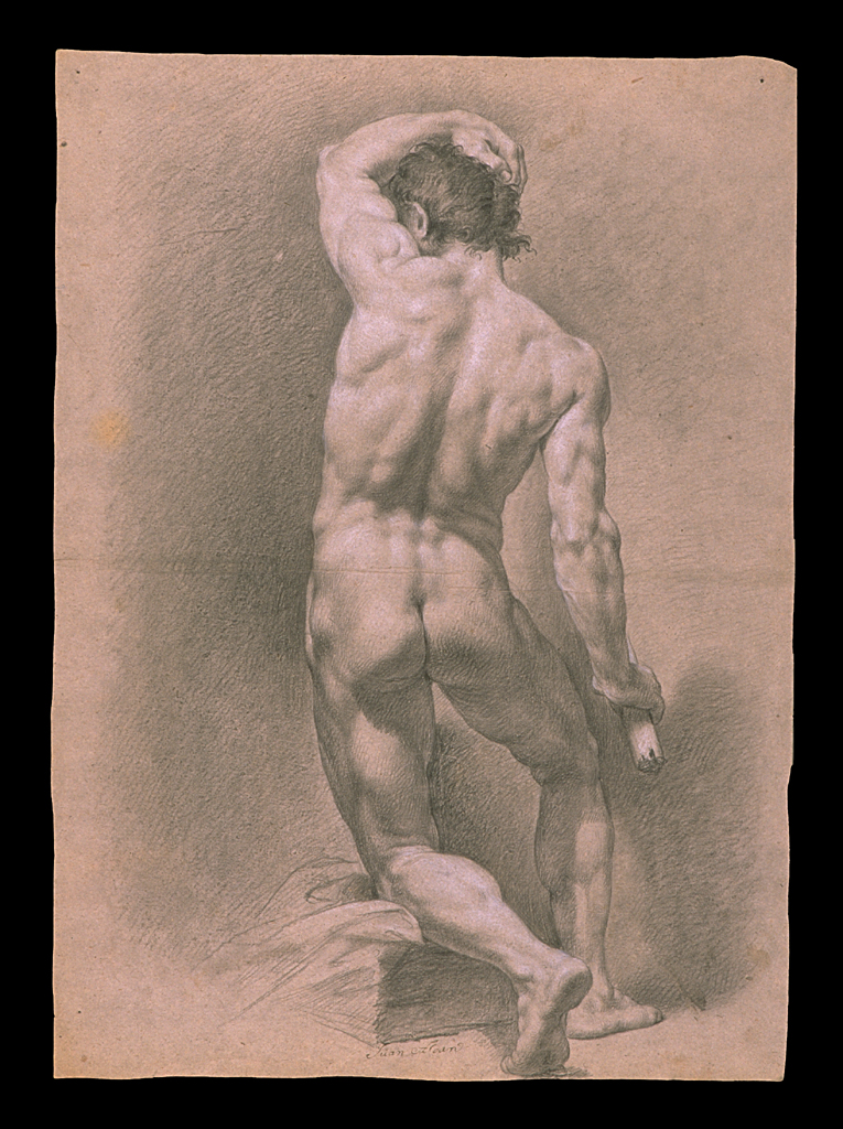
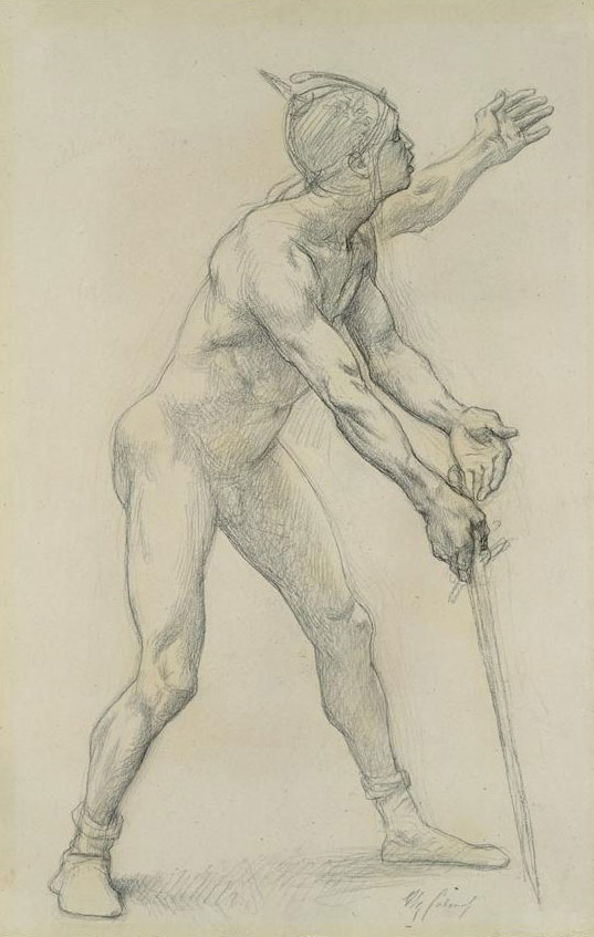
The difference between this system, and the system of say Vilppu, Bridgman, etc, is in the rendering. It is not just a system of construction - but a refined tonal system as well that was used most notably by Michelangelo in his figure studies, possibly in his paintings as well.
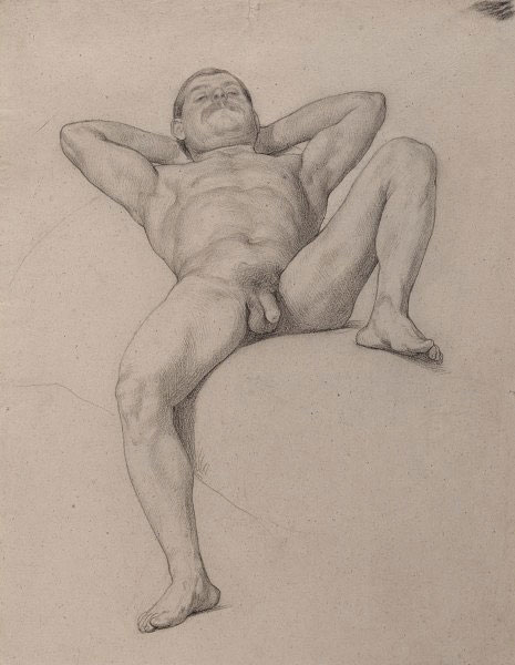
The model studies done in this system are from anywhere between 2min - 50hours.
More or less.

---

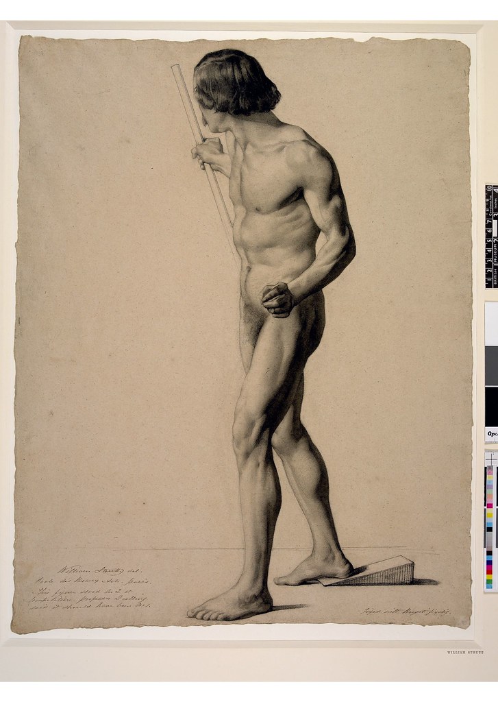
Perspective and construction.

In the basic renaissance system you immediately set up perspective - you work in 3 dimensions right away! This is done to get the understanding of mass, construction, gesture. You idialize as well - that is, you construct a sort of idialized version of the model - you will be using your constructed perspective lines rather than the model(you can even exaggerate perspective if you prefer!!) You will have to look at the model from different angles - especially the side! If you look at the model from the side, you will see where the up planes are located - you will be constructing the main light from above and any direction you choose. Sometimes from the side, front, and most rarely - below. Except from the back. (you do NOT set up any lightsources, you simply imagine where the light is comming from)

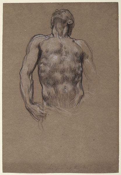
You will be modelling the edges - work on the edges to show the turning of planes. (Most shade on edges)
In this system an edge is the meeting of two planes.

You will be controlling the direction of the eye by using atmospheric perspective - what is most in the front - the highest contrast. (the difference in tone between what is in front and in the back might be extremely subtle. )


Crosshatch :
You will be using completely free lines, that are supposed to follow the 3d form of the model. Like the pen sketches of Michelangelo. The most important is loosenes and freedom! with time you'll get to draw like Michelangelo, that is, when you start to understand the form and perspective.
Your lines will automaticaly turn into shade as you work in layers, multiple lines. (layers explained later)

You'll use flow through lines, especially as a way to get good proportions and working with the figure as a whole.

You won't use eraser except later, when you are doing the light planes. You will be using your kneded eraser as a white pencil.

You won't measure, never(except in your mind). You have to understand mass and sort of feel the proportions. In the beginning your result will be horrible. But when you get the feeling of mass and perspective down as a 6th sense, it will be easy. The proportions will get better and better.

You never have to draw something exactly the way it looks. So in the beginning your horrible result is ok. Also it will take some time before you understand how to work in layers. Check out Michelangelos pen drawings. He is the ideal.

Your instructor will sometimes tell you to erase part of the drawing and start all over with this part.... You can have completed a whole leg, and then you have to move it, this happens if you have lost the feeling of the whole - focused too much on a specific part.

Draw transparent in the beginning - if one leg crosses the other - complete the behind leg. NEVER break a line that is going behind another form.

You want a mess of lines. When you decide which one is correct you just give it a darker tone - you don't have to erase the other lines. You will erase them only if they are on a light plane. If not you will probably shade over them anyways.

Use complete constructions. Complete all forms. Draw them through - continue them on the other side, like if you had x-ray eyes. (and always construct perspective)

Often the old masters made a complete sketch of something that would acually be behind something else. This was necessary in order to think in terms of complete forms.
I think Michelangelo is seen as the one who achieved the most advanced results.

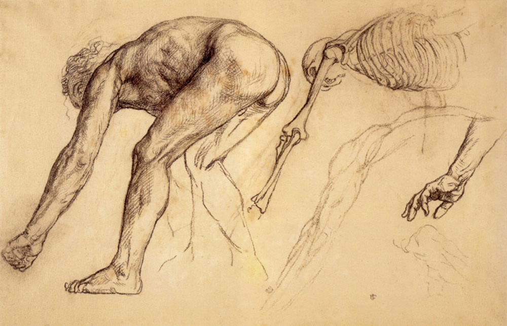
You will be using anatomy right away - constructional anatomy - 3d anatomy.

Draw bones - allways. When you look at the model - you'll be drawing the underlining bones. If you don't have them in mind and you are drawing, lets say an arm - just pick up the corresponding armbone, look at it in the same perspective as the arm on the model - and in this way figure out the bonal structure of the model.

About light and shade on planes - you will be using a guiding cube that you can put next to your drawing. One plane is 100% shade, another 100% light another 50% of each. This is Michelangelos school! (I think Leonardo suggests more softness, also Raphael is more soft)
But in the beginning all you care about is form!!!!! The other stuff is a later study.

Drawing is a communication of form. Therefore, DO NOT CONSTRUCT CAST SHADOWS YET. Learn to think ONLY in terms of planes. (when you master form you'll start to do cast shadows)
But cast shadows aren't neccesary to show form - so at least if you do anatomical sketches - dont use cast shadows!

Subdivide tone in the different planes (this is where the russian school differs the most from the american constructional system)
Study Michelangelo - he uses the most amount of subdivision.
In your light planes you will be lightly subdividing, in the shaded planes you will be subdividing with stronger tones.

In the beginning, treat everything as if it was made of the same material, draw only form - A person with black skin will be drawn the same as a person with white skin. Form is the only thing truly important in this system!
This is the beginning - later you will learn to work with and master the different skin tones etc. But first your understanding of form, planes, construction and perspective must be perfect.

---

How to work in layers.

Working in layers is the way the crosshatch technique is taught, you just work your way into the figure(because you have no actual tonal reference, other than your tonal guiding cube) - you can do this method with pen as well...

There are two different layers - tonal and anatomical.

Anatomical

First layer is the overall anatomical structure of the big forms, the box of the pelvis and the open box/egg of the ribcage and so on.. - And the flow of the middle lines(spinal column, sternum, linea alba...) You'll use the x-ray vision and constructed perspective . Always keep both the sternum and spinal column in mind(draw it or think it - whatever works for you)
And the feet are the most important because they determine the weight and pose of the figure - force yourself to see them in perspective right away, get a feel of the plane they are standing on.

Second anatomical layer is the inner skeletal structure of all the bones and muscles.
You want to see the big anatomical picture, and then break this down into smaller forms, and break the smaller forms down into even smaller forms... and so forth(you'll even break bones down into different structural shapes...). But you always keep a strong feeling of connection. - all small forms belongs to a bigger form.
For example, the phalanges belongs to the finger, the finger to the hand, The hand, lower arm and upper arm belongs to the whole arm. The shoulder connects the arm to the body, and so forth. You will be drawing the bones first, then draw the muscles on top.
In the beginning a disconnected look of bones and muscles is normal - this is just untill you figure out the anatomical and structural connections.

--

The tonal layers.

The reason you do tonal layers are in order to explain general form and plane changes. An edge is a line between two planes. In general you model the edges to explain the change in direction of form.
Your goal is to communicate the form independently of light(sculptural). So you will create your own light source and sometimes move it around a bit freely to enhance the visual communication.

First layer

3 basic tones.(light values - you will make them darker later...)

Make your own light source in your head! Think in terms of the big masses - crosshatch or tone down first the side and down planes(on a figure constructed in these basic shapes/planes)

Second layer

When you start to move into the detailed anatomical layer, you will also move into the detailed layer of different light intensity. So that if you have decided to tone down the side plane 50% - you model the planes located on the side plane in similar values - like 30-70%
So all up planes located on the side planes would have like 30% and all down planes located on the side plane would have like 70% and planes turned in other direction will have other values in between the two, or something like that. (this is a VERY general idea, do whatever explains form)
And on the down planes you'll model in even darker tones...
And on the light planes you'll model in lighter tones.
In this way you'll keep the strongest feeling of the big boxes (about 3 basic planes, each subdivided into different tones). Because you can clearly distinguise the big planes, and the small planes located on these big planes. This is called the sculptural approach. And my understanding of it is very limited! (but just study Michelangelo and you'll figure it out )
But there are other principles that change the amount of tone you'll use - like atmospheric lighting, atmospheric perspective, reflected lighting, constructed cast shadows. and so forth.

---

How to copy a master drawing ::

First understand the reason for doing a master copy - you want to learn how this master thought about the figure(a drawing is thoughts).
Remember he worked in layers!!!!!!!!!
You will be drawing it as if it were an actual 3d object in front of you!!!(use persepctive construction right away)
Sometimes his constructional lines wont be obvious. They are there none the less. Sometimes you will see these x-ray lines, sometimes you wont!
In order to do a perfect copy of a master drawing you'll need the same amount of anatomical knowledge and skill as the master. If your skill and knowledge is higher - you should be able to improve the master drawing. If your skill and knowledge is worse, you'll make it worse.
IN SHORT - you can't draw properly that which you do not understand.

--

All right, I hope this is at least partly understandable.


Read more: http://www.conceptart.org/forums/showthread.php/160487-Realism-vs-construction(a-guide-to-choosing-the-right-art-education)/page19#ixzz3PnBabH1v

Friday, January 23, 2015

greyscale drawrins


 Lol eye know, eye know!! Looking like when Picasso was just starting to go abstract, or an early Modigliani..


This one inspired by yet another Steve Huston video. 2 charcoal pencils, a 2b and a 6b, plus the black charcoal eraser that came with my General's charcoal set, on Strathmore vellum bristol.

Wednesday, January 21, 2015

finding better pens - are rollerballs the answer? (NO!!)

The quest for a decent ballpoint style pen continues. I decided to do a web search to see if other people had gone through the same kind of search and of course they have - found a blog post where the guy basically said the first rule is avoid Bic like the plague. Basically because they just make cheap ballpoint pens and ballpoint pens skip all the time. Is it just me, or were ballpoints better when I was in high school? Seems like just about everything was better, and that's not just nostalgia - I've seen endless complaints from artists that the quality of all the products is deteriorating. Windsor/Newton Series 7 sable brushes used to be the best, as was Strathmore paper - now they've both been largely outsourced to cheap Asian manufacturers, with maybe one or 2 factories still located inEngland or wherever they originally were located, and now if you order from them you don't know if you're going to get the high quality stuff made by lifelong artisans or cheap sweatshop junk. It's happening to everything that used to be high quality.

Anyway, what I got form that blog was to try rollerball pens. They're similar to ballpoints, but they don't skip. I'm talking about liquid ink rollerballs specifically here - they come in liquid or gel, and the gel version tends to leak big blobs of ink randomly. That's what my G2 pens are, and it's what they do unfortunately. I really love the big fat bold lines I can get with them, but the sudden unexpected blobs make them impossible to draw with. I believe any gel pen is a rollerball, as a good rule of thumb - the thicker gel ink wont go through a standard ballpoint mechanism.

So I ordered Uniball Powertank pens in the Bold size. They're made to work like a ballpoint but not skip - and to lay down a more wet line like a fountain pen. And the ink cartridges are pressurized - they'll work upside-down, underwater, and in space. Tested one and not a single skip when I scribbled all over a piece of paper. The line isn't quite as thick as I'd like though and I haven't been able to find any broader than a bold. Well, I guess I can live with it - it's nearly as wide as I'd like, and I think I tend to draw too thick anyway most of the time. That's one of the things I really need to learn, minimalism. Not so freaking thick and not so many lines all over the place!!

The reason I do like a bold pen is because you can easily get a very light thin line with any ballpoint type pen, just by applying less pressure*. So if you have a bold pen then you have a complete range of line weights in one instrument and you can switch between them on the fly as easy as thought. No need to swap out one pen for another.

* Applies only to ballpoints, not rollerball pens unfortunately. See below:

Addendum:
A little more research reveals that rollerball pens with liquid ink actually don't have the same life as ballpoints - the line tends to be more mechanical in width with less variation possible - they won't go as thick or as thin. No wonder I'm less than happy with the Uniballs! It's starting to look like I either use regular ballpoints and put up with the constant skipping, or just give up on this mad quest.

watevr (hey, you try coming up with names for every freaking post!!)


Saturday, January 17, 2015

Working out my system for ink and wash drawing with Copics and Tombows


After the legendary Jose Pepe Gonzalez. This was done using my new system, or at least working it out. I did a little digital cleanup on it above, below you can see the before and all the scribbling and writing I did on the page. 


As for the system - the .9 mechanical pencil was way too big, so I've since brought down a .3 instead. The only other fail was, sadly, the Pilot Petit3 brush pen. It is my absolute favorite of all the brush pens I've tried because of 2 factors the rest lack - the ink flows fast enough and is black enough that it doesn't skip out or fade to a light grey at normal drawing speeds, and the nylon nib is quite narrow with a good point and is probably the stiffest one I've interviewed, meaning that it won't suddenly go form thin line to big fat blob-line because your hand inadvertently twitched or relaxed a bit. I suppose I haven't developed the fine touch needed for delicate brush drawing yet, and these hard fude brush pens are made for us ham-fisted beginners. The only reason it's a fail is because the ink isn't waterproof and smears out into the Tombow markers when I'm adding a wash. The scribbles across the top of the page are with the Copic Multiliner BS and BM (Brush Small and Brush Medium - those silly Japanese and their inadvertently funny abbreviations!) It's actually the first time I had tried the BM, and it turns out to be very stiff, though I wish the tip was finer. Between both of them they almost do the job of the Petit3, but are completely and instantly waterproof.  So, with the new substitutions, my pen-and-marker-based ink and wash drawing system is quite possible perfected now.

The correction you can see along the top of her hand - where I tried to cover up some black ink with the Sharpie poster paint marker - was unfortunately the Petit3, so it bled into the white paint and stained it gray, which the waterproof inks don't do. At least I don't think they do. (EDIT - they do. Still need to find a replacement for the Sharpie poster paint markers.)


Playing around with some ballpoint doodles, getting frustrated because they keep cutting out on me. About to give up on them. Then I decided to move beyond all this gesture and quicksketch stuff and draw in a more finished comic book style - depicting the surface again rather than just pure form and movement, and paying attention to creating a nice finish. Ah, it felt good! Been too long since I drew like this! Rather than pencil though I did the initial sketch in light grey Tombow. And on this one I tailored the Tombow wash rather extensively - you can blend the grays together beautifully using a waterbrush and the colorless blender, as well as the standard method of using a lighter marker to blend over a darker one. I really love this combination of Copics and Tombows! If I keep drawing like this I'll begin to drop back into tight mode, something I think I really need to do.


I've posted the 2 above previously, but I did some more wash work around them that improved them nicely. 


And yet another landscape study, This one done fast because I really wanted to just go to bed. Still took 50 minutes before I was happy with it. 

Marker throwdown - Copic sketch markers versus Tombow dual brush pens

Lately I've been accumulating a lot of different kinds of pens and markers, trying to find the ones that suit me best, and in the pen department the Copic Multiliners are the clear winners. I was actually quite happy with the Tombow dual brush pens already, but was strongly drawn to the lure of the almighty Copic sketch markers. So I ordered a set of grays, which incidentally includes a 0.5 black Multiliner SP. Below is my test of the Sketch markers:


I was pleased to discover the Copic claim holds true (at least in this test) - it didn't smear the black Multiliner line I had just drawn moments before. They do blend quite nicely, but somehow differently from the water based Tombows, which look more like a real ink wash. Alcohol affects paper very differently than water does, in several ways. For one you can soak a sheet of paper with alcohol and as it evaporates the paper won't potato-chip up the way it does with washes or watercolors. That is a good thing. But there's also a bad thing..


I did this test in my Stillman & Birn Alpha sketchbook, which is far and away the best paper I've ever had the pleasure of using for anything. It's pretty thin, so washes don't make it buckle too much and it will lay down easily afterwards - something thick paper won't do. And I was dismayed and horrified to find it had bled profusely through the first sheet, demolishing the drawing behind it, and even onto the next sheet (so glad I had at least scanned these drawings before that happened!) I tried it in the Copic marker sketchbook and it went even farther, onto the third sheet. That's even thinner paper with a very slick hard surface (and I really don't like drawing on it at all).

So my initial conclusion is that for most purposes the Tombows are the clear winner. The Copics tend toward a more smooth blending that to me looks a bit artificial, opposed to the natural wash look of the Tombows. If I do decide to use the Copics I would probably use a single sheet of paper rather than work in a sketchbook, or I'd have to resign myself to drawing only on one side of each page in a sketchbook and insert either a thick, slick piece of paper (or 2?) or maybe a plastic sheet behind it to protect the next page.

Oh, another thing I dislike about the Copic sketch markers - the caps won't fit onto the back of the marker when you take them off, you just have to lay them on the table and hope they don't fall on the floor and disappear or something. The Tombows beat the hell out of them in that department - the caps are specially designed so either one will pop perfectly onto the opposite end.

Ok coming soon in the ongoing epic battle of the pens and markers - Multiliner SPs versus the cheap plastic, non-refillable Multiliners.

Friday, January 16, 2015

Pens pens pens - drawing with the Falcon again


Inspired to bust out the Falcon once again by the new NMA video featuring Glenn Vilppu:

And it was very cool to see him using the water brush with the Falcon again. Apparently he hasn't done it for a long time. I really dug the ones where he started with the waterbrush with some wash in it - I simulated that by starting with a light grey Tombow brush tip, and on the last one I finished with the black Tombow. I also sort of used a little Stanchfield at times - I feel I need that more free and exploratory approach rather than Vilppu's strict form building.

Got in a bunch of brush pens (fude) from Jet Pens (Japanese importer in New York I believe) and also a few ballpoints. Of all of these the only likely candidates seem to be the Bic Velocity - nice broad point pen but it keeps cutting out on me (More later), and the little Petit3 refillable brush pen. The rest of the ballpoints are too thin and scratchy or a weird shade of blue, and the rest of the brush pens can't keep up with even a moderately fast line, they skip out and turn light grey, or already are to begin with.  Though I do think I scored with the white Sharpie poster paint pens.

On the ballpoint front - all the decent ones I have (Velocities, plus the old Silk Writers) keep cutting out every few seconds which is super annoying. I thought to look up ways of fixing that and discovered rubbing alcohol and holding the tip over a flame briefly, plus just good old scribbling. One article also mentioned tapping the pen's tip on the table a few times. These tricks seemed to be helping, though not completely fixing it (apparently long term storage causes ink to dry out behind the ball point, and writing or drawing with one for a day or so often breaks it in). But unfortunately the little plastic tip on the Velocity pens is really cheap and thin and made of brittle plastic that breaks into pieces with gentle tapping, a little heat, or even apparently vigorous scribbling. Went through 3 of them already!! Finally hit on the idea to take the refill out and just work on that, then put it in a body only if it shows some promise. And never try to fix it in the body, always pull it out first. I also decided if worse comes to worst I can actually draw even with a pen that cuts out regularly - hell, I've been doing it with the old SilkWriters this whole time!