Tuesday, April 30, 2013

Catching up... and I CAN FREAKING PAINT NOW!!!


Longbow-Evolution

Longbow-Evolution-2


Crick

 photo BemusedNewv2_zps7c421de4.jpg

 photo dirt_zps8f178943.jpg

 photo dirt2_zps77c0129f.jpg

 photo dirt3_zpsa91cce1c.jpg

 photo Colorform_zps4498bd8e.jpg

This is amazing... I can't believe I can actually PAINT now!! Was starting to think it was never going to happen. But thanks to photoshop and my tablet I can get the colors and values in the right places now and make it all look good! And suddenly it's like I've busted through that wall I've been beating my head against for a few decades - the wall that's always stopped me from working in full color. Busted through and I find myself in an entirely new realm of amazing freedom and vast spaces and colors. Incredibly exciting!! And now the skills I had developed in pencil are rising up to their old levels and beyond - and I'm extremely happy to note that my concepts about the human figure, anatomy and picture-making in general have reached new levels of sophistication.

Working in color gives you far more subtlety than greyscale ever could.

Saturday, April 20, 2013

Full canvas revealed at last! plus New simplified background


Made a drastic decision concerning the background - the X shape behind him was very distracting and unnecessary - all attention would be on him regardless. I was really unsure as I did this, but I like it - in fact it looks very Frazetta-esque. Now I can really see the left half as a back cover, and the little rock spur on the right is suggesting a story for the front cover.

Lol his head looks really stupid now - seems too small and I finally faced the fact that it needs to be completely redrawn. So does his entire abdomen/pelvis - I might need to temporarily extend the canvas downward far enough to sketch in his legs so I can figure out the pelvis form.

Really digging' the new simplicity! I'll probably airbrush in some lighter purple here and there just to break up the flat solidity of it.

"It's full of bows... "


The title is the line that first occurred to me when trying to think of a name for today's post. It comes from 2001: A Space Odyssey - the original line is "It's full of stars", but I wanted to denote the new discovery I've made about the way this painting is starting to look. Originally the composition was built almost entirely from triangles, but as I've been developing the anatomy and gradually fixing the structural problems (mostly associated with that damn upraised arm) I noticed the triangles have begun to take on a slightly different look - for example look at the line of the underside of both arms, and at the lower edge of his ribcage. As it all comes into focus and takes on its form the triangles are looking strangely - bowed.

At first I wasn't thinking bows - I was thinking brackets. You know, like on the keyboard - not the simple parentheses but the more compound double-bowed shape of the fancier brackets {these guys}. Then I realized with somewhat of a thrill what those brackets resemble.

Ironically {and I had to laugh out loud when I realized this} the line from 2001 was spoken by the character Dave Bowman...


Anyway, I'm still hammering out the issues with the structure of the drawing - getting the figure and all elements of the composition properly shaped. I'm willing to spend as long as it takes to do this - I really like the way it's firming up. Next I move on to getting the values right, and then colors. The separation of drawing, shading and coloring, as espoused by the Renaissance masters. You really do need to tackle them in that order - or at least I think you do (still pretty new to this though). It's working for me anyway.

Friday, April 19, 2013

Form Studies


Didn't like the perspective on that last one so I reworked it a bit:


This stuff is pretty hard to do for weird reasons - creating the masks takes forever and you run into all kinds of unforeseen problems, especially when trying to do perspective. I also don't really like the mechanical airbrushy look of them - I want to do freehand painted versions soon. Plus - I couldn't even tell you where the light source is in those last two! Sort of abstract. Hmmmmm - perspective is still off too..


Kept messing with it, playing around a lot with the Dissolve mode and a bit of blur to soften edges - this looks a lot better! Less mechanical, more organic. This is doubtless far better than a completely freehand sphere painting - no problem with starting from a mechanically perfect circle as long as you overpaint enough to disguise its origins and make it look all soft and fuzzy like this. 


Ok, Getting tired of re-working this one, but I corrected the overdark shading and the overbright highlight. Developing my photoshop muscles. 

Thursday, April 18, 2013

Advice to myself - try starting with greyscale painting then add colors

All the endless tweaking and noodling I"m doing on this painting is due to the fact that I didn't start with a good drawing or underpainting - instead I started trying to modify an existing oil painting by chopping and rearranging and stretching parts of it, and then I started little by little very timidly, adding in tentative bits of color that were never strong enough (nor were the values).

Unless I start with a full value drawing I'm afraid I'll always be too timid with the lights and darks, and also with strong colors.

But by starting with a full-range tonal underpainting in greyscale I eliminate the problem of having to work up to darks and lights. At least in pencil I seem to be able to handle that well enough - hopefully it works in digipaint too.

Then I can use something like maybe the color replacement tool to start to change the greyscale to colors, and then just go in with direct painting. Which brings up my next bit af advice to myself:

Direct painting is the way to go most of the time. 
I'm glad I did so much messing around with adjustment layers and the various Transform techniques and the Liquify filter, but it tends to take way too long to do things that way and too many little recovery steps afterwards to fis up the unexpected mistakes that occur. I usually find when I;m messing with that stuff it goes on endlessly, and then when I finally decide screw this I'm going to paint directly on the background layer itself then I get rolling for real. I really am glad I did it all though - I've learned so much about using photoshop, so it's been an excellent learning stage.

I want to do simpler paintings and work out a speedpaint system.
This one has become so detailed and painstaking I can hardly believe it! I seem to be packing every square inch with full details to a minute scale - this is not the way Uncle Frank painted!! Working in pencil I know how to simplify, where to make a focal area and where to fade detail and just use basic composition. But by doing such a sheer volume of painting and repainting and repairing and re-doing and un-doing etc I'm really making this one into a huge learning experience - by the time it's done it'll be the equivalent of a year's worth of lesser paintings.

... That is all. Thank you.

Tuesday, April 16, 2013

Going too far and getting back again, learning new techniques for modeling form in Photoshop


All that tweaking I was doing resulted in an overworked image that wasn't nearly as strong as the original was - after several days of it I realized that and made the painful decision to go back to an earlier version. Actually I overworked it again after that and just went back again to another early version for the body - though I'm keeping the terrain (at least so far).

It's stupidly easy to overwork things - to go into detail rendering mode and lose track of the form itself. I went back to this one because here his chest looks mighty, whereas in my overwrought version I had reduced it to looking rather emaciated. Couldn't tell until I compared them directly.

Rough in with big hard opaque brushes!!!
But in better news, I've been looking at a Conceptart thread about learning to paint in Photoshop and have picked up some better habits - for instance blocking in with big hard round brushes set to a high opacity (like 85 - 100%). And then create in-between colors by using a transparent brush with one color over the other, pick it up and use it with a nearly opaque brush, and make your brushes progressively smaller as you go. Then after developing your form roughly in this way (probably farther than I have here actually) you can start to use transparency. That only comes in near the end as a sweetener.

I'm beginning to realize it's necessary in your initial block-in to use your darkest and lightest colors right from the beginning - if you try to build up to them as I tend to do it takes forever and you get too timid about it.

Great Photoshop advice about working size and printing:

For print, most printers print at either 150, 200, or 300 dpi.

-If you're just doing this for a sketch, 72 dpi is fine (since that's what we see at screen res)-150 dpi is fairly standard and to print at 8.5x11" you need to work at around 1300x1700-I personally like to begin around 2000x3000, but sometimes if I know I want to hang this on my wall (like the portrait below) I up it to the point where it'll print at 18x24" (5400x7200)


Secondly, you need to consider which version of photoshop you're using. I find that any version before CS will run smoothly on just about any computer, but if you're using one of the Creative Suite editions, you may want to lower the resolution to decrease lag time.


Another serious point to take into consideration is the power of your computer. Again, if you're doing this for print, you'll want to work at as high a resolution as possible but for sketching and practice (the apples and such) you really need to consider what your computer can HANDLE. I'm writing this while using Photoshop CS3.

-If you have less than a gig of RAM, then it'll be really difficult to work at any resolution higher than 2000x3000, and even then that may lag. One way to counter this is to use brushes with high spacing, as this allows the computer to track fewer instances of the brush.-From 1 gig to 2 gigs of RAM, You can really work up to 7200px per side without trouble, but larger poster sized stuff might cause problems.-Anything higher than 2 gigs of RAM should run smooooooth unless you're using some cracked out 700 px textured brush.
"As for the size, it's always good to work at a higher size than you intend to actually use. If your computer could handle it, then double the size would be great, but even a third greater (3300x5100 pixels. 3300/3 & 5100/3 = 1100x1700. Add it all up and you end up at 14.667x22.667 inches) gives you a bit of extra room to get in close and work with your details without having to worry about being pixel-perfect, as working at your printing res would entail. Then when you're done you can just (in Photoshop) do Image > Image Size and enter in the values you'd like to print at and it'll scale it down for you.
Whichever way you choose, if you want to see what the result will be looking like when printed while you're actually painting, being zoomed at 25% (24 really) is what it ends up looking like at 300dpi. So at 150 it'd be 50% (48%) zoom. (I say the rounded up versions because it's just easier and quicker to get to using the keyboard shortcuts Ctrl+ +/-)"

Monday, April 8, 2013

It Ain't Easy (or - You Wouldn't Like Me When I'm Angry... )


Recording this little trick here so I won't forget how I did it -

Basically I was getting bothered by how hot the skin tones were - all reds oranges and yellows, nothing cooler like blue or green. So I decided to try making a green mask and blending it down. I copied the image to a new layer and used the Color Replacement Tool to turn the skin tones entirely green. I placed that layer on top of the original image and switched it to Darken mode (kept wavering between Darken and Multiply, but darken is much subtler and doesn't bring the darks down the way multiply does, it only affects the light and mid tones apparently).

I lowered the opacity level till I could clearly see both files at the same time and then used the eraser to remove most of the green stuff and to fade it selectively in places, so I ended up with it only in the areas I wanted cooled off and neutralized. I'd turn opacity up to work on it, then fade it until it blended very subtlely - I believe it ended up at about 9%.

The result is so subtle you might have to look at the first and last images a few times to notice it, but it definitely changes things. Where the green mask is the skin tones now look like burnt umber (darker cooler earth tone) and everywhere else it looks more like burnt sienna (warm reddish earth tone).

I think I'll mess around with masks like this for yellows and any other colors I might want to scumble in here and there with ultimate control.

In other news - I'm still tweaking the pose and anatomy minutely and making lots of subtle adjustments to color saturation and contrast etc. My most-used tools the last few days have been the liquify filter (amazing what you can do with it!) and various adjustment layers - specifically saturation, levels and the occasional photo filter, which is great for drawing the color scheme together across an entire painting or for cooling or warming an entire figure or affecting contrast only of certain colors.

I'm starting to really learn how to use Photoshop now, and how to paint with a tablet. Getting better at drawing with it too, but I can see it'll never be anywhere near as good a drawing tool as a trusty pencil. I'll be scanning in drawings to work from for the foreseeable future, thank you very much!

Friday, April 5, 2013

Tweaking tweaking tweaking...


Always with a previous version open beside photoshop to keep me from going off track, which would have happened many times.

After flattening your layers, always copy the whole painting onto a new layer and work on that, so you always have the original image there under everything. Then it's easy to switch back and forth and see exactly what's changed.

I've ended up many times deciding to scrap hours' worth of  work and go back to an earlier stage. It's frustrating but it's good to know you have that much control, and it's taking my skills to an unprecedented level (for me I mean).

I'm doing almost all my work on layers and flattening when it looks good. I can use the eraser to clean up edges or blend layers by using different combinations of opacity and layer types (ie Normal, Multiply, Darken etc).

I've also found a nice way to blend down rough marks such as all those scribbly lines from the early rough-in. I don't like a smooth airbrushed look, but the marks are too rough, so I go back and forth with the Lighten and Darken brushes set to very low opacity and select nice in-between colors. You end up with all the life and vitality of those spontaneous marks but nicely blended and smoothed. It's looking a bit soft and mushy now though, definitely need to strike in some nice dark accents.

I keep surgically lopping off that upraised arm and moving it around, trying to get it to fit properly into the shoulder socket. I'm astonished at the endless ability photoshop allows to reshape and move things around. It still doesn't look quite right though. Think I need to peel off the deltoid muscle and work on just the arm, then wrap the pectoral over and paint in a new deltoid.

Tuesday, April 2, 2013

Treble Fafhrd


Three stages of development.

The important factors:


  • Kept checking anatomy against my ecorche figure (anatomical model)
  • Opened previous version beside photoshop

My ecrche figure from Anatomytools.com comes apart into several pieces - the arms and head pop off and are held in place with magnets. So for the difficult fiddliest part of the painting, which obviously is the upraised arm with all it's foreshortening, compressions, and torsion, I was able to just hold up the right arm at the right angle - one angle for the underside of the upper arm and a different angle for the forearm. This is definitely improving my anatomy, but I can see I need some good reference for that upraised arm - an ecorche doesn't show you ho the flesh compresses when the elbow is in extreme compression like that. Need to find photoref, or look in a mirror and imagine that I have muscles.

Opening a previous version of the image was a lifesaver - as you can see from the second version in the middle, while improving it I was also screwing it up in ways I wasn't aware of. Not only the most obvious - that I made the new upraised arm too big, but also I lost the simple powerful compositional form of the triangular shadow on the back of the upraised hand and the similar dark triangle on the back of his neck. 

Most of the work last night was on the upraised arm - the most difficult and detailed part but vitally important to get just right. This session was totally different from the last one, which went so smoothly. This time it was more of a brutal and difficult struggle, constantly making little changes and then going back and changing it again and again. I've now discovered the power of the Distort tool (under Image > Transform) and that' together with Free Transform and the Liquify filter, have been my best friends. I really wish I had the figure and background on separate layers though - each time you use one of those tools it leaves scars on the background that you need to paint over, changing it each time. Next time Ill know. In fact, later in this painting I might go back to one f the earliest versions of the background and paste it in on a layer behind the figure, and then overpaint where needed to cover the parts of the old figure showing through here and there. 

The importance of David Lemon
David Lemon is a sculptor who posts his progress almost daily on YouTube, and I always look forward to my visits to his studio. He's a great guy and really cool about explaining what he's thinking as he works and reworks his sculptures. And one thing I've learned from him is to continually check and re-check proportioning and anatomy all the way through. At any stage when he discovers a mistake he'll fearlessly lop off the offending part and rework it. And it's always an improvement. Well, making changes like that, little or big is one of the main strengths of digital painting, so might as well take advantage of it. 


Monday, April 1, 2013

Bingo!! Nailed my technique for speed paint!


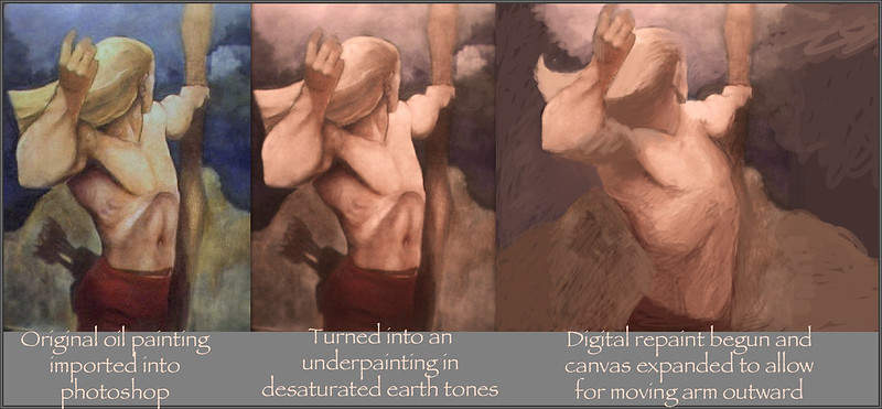
Things have been going fast and furious since the last post. I had noticed how compressed and cramped the pose looked and decided to try to fix it by cutting it up and using free transform and the liquify filter, and after a little while I was going to just trash it because it was looking literally horrible!! But before trashing it I decided to just try to do a little digital painting here and there and see if I could salvage it. Lo and behold, it worked rather excellently!!

I believe the reason it went so well is because I had worked so hard to get the colors right, and now I was picking colors right off the painting to work with. I just used the brush tool on normal, switching opacity between maybe about 12, 25, 50, and occasionally as high as 85% now and then. The result was breathtaking - literally I was able to draw fast and in terms of form and lighting right from the get-go. It's because I had a really good palette of colors - just 5 or 6 colors all in the earth tones, ranging from near black to near white. It's like drawing with pastels (except it works a hell of a lot better for me). And it's so easy to quickly try something and paint it out if it doesn't work. It's also easy to sort of sketch in a form loosely, start to develop it, and see as you go if it needs a little tweaking or to be moved or changed. Working like this is incredibly intuitive for me - I do believe I've found the perfect method for developing a painting.

Also, let me add - and this is vital - the colors are closely analogous to each other - they harmonize very well together. 

Oh, another important factor - 
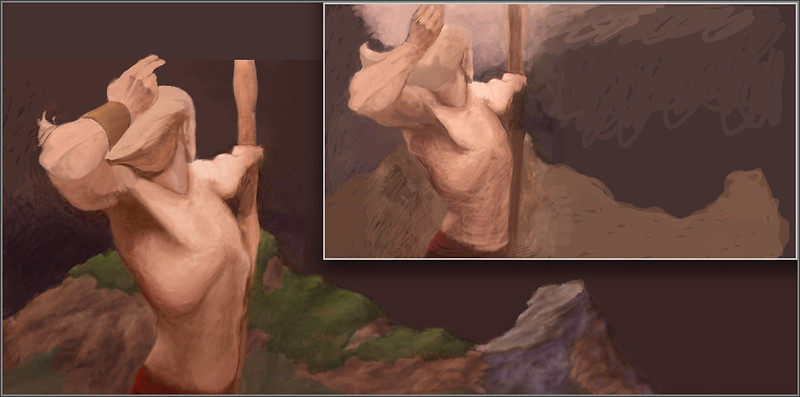
I'm wrapping lines around form. I guess the lessons I worked so hard to learn earlier on this blog have sunk in.

Epiphany - I just realized - I made these colors by strongly desaturating the yellows greens and blues and adding 2 orange filters to what was left. Maybe I could put my palette colors through such a process to unify and harmonize them. Because I notice after processing like this the colors look very different than what I can seem to make directly in photoshop, which always seem more pure and saturated.

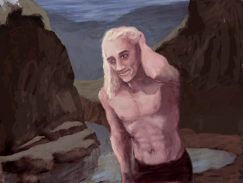
And once I've got a speedpaint done this way and worked out all the details then I can use the digital projector (the one I watch blu-rays on in the next room) and project it up onto a canvas, mix up a palette of colors taken directly form the colors I used in the speedpaint, and block in right on the canvas, in oil paint, while standing in front of the projector.

I gotta tell ya, I'm super excited about this - I really believe I've just solved a whole slew of problems and developed a perfect working method for me. Another benefit - I think the way I:m sketching in my figure over a toned ground using the earth tones is also going to work when I tackle my next oil painting. I hope so anyway - if so this is like a triple breakthrough for me.

I've alo figured out a way to draw other characters, each sketched very loosely at first on their own layer, and when they look right I can move them around where I want them and then flatten the image - or I can keep them all on separate layers for as long as seems necessary. What a way to play around with compositions!!

I've actually extended the painting a lot farther to the right than is visible in the last picture above because I decided this looks like the back cover of a portfolio or a book, and whatever Faf is shooting at can be on the front. Or actually I've thought of something even better, but it's gotta wait till next update.

All of this - a super-massive artistic leap forward for me (after the long technical exercise that was this blog up until tonight) - all on Easter sunday/April Fool's Day night (and no, this is not an April Fool's joke!)