Thursday, December 31, 2015

Last painting for 2015


Lol I can't understand his abs at all - I could try to paint abs off another picture - maybe I will at some point, but I'm happy enough with this to call it done and move on.

Here's an older painting I did of the same guy. His name is Wanderlei Silva (pronounced Vanderlay):


Happy New Year!! 

Sunday, December 27, 2015

OK - about those new techniques..


First I did a threshold adjustment on the reference after making it greyscale. This really helps you see exactly where to put the lights, mids and darks. I kept this open alongside the full color reference:


I worked out the basic underpainting in greyscale, and it was rough as hell for a while (this was before I decided to start working smooth)


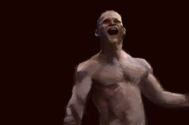
I then used an HSL adjustment layer to turn it to a flesh base color and a few color layers to shift the tint slightly in places, so it wouldn't end up all one simple flesh color. As I did this I was careful to avoid primaries and secondaries - they tend to look cartoonish. So I went more toward tertieries and 'dirtied-up color'. I also was very conscious of the fact that all my paintings until now have weird ugly colors - I tried to make them look better. I kept my brush very transparent for this color layer work, and used a soft round brush to erase the edges so they blend nicely. Also you can see that I used some chalk brush and layered over it with hard and soft round brushes to get a variety of textures and edges. At this point I had lost the brightness of the highlights, they need to be brought back up with a Levels adjustment layer. It was somewhere around this point when I wrote my Christmas day post and decided to start working smooth, so from here I started using a combination of soft and hard round brushes with careful transparency to smooth things out. I was going to just smooth it all out completely, brushstrokes be damned! But I found I didn't need to go that far - by smoothing out to the the right amount I pulled it all together and made it look coherent and gave it a nice sense of surface, without losing the vigorous brush work. n fct it looks much more painterly like this. 

I've come to realize one of my worst problems with attempted brushstrokes - I used to set the brush on low opacity and scribble around with it, thinking it would look like brushwork. But it just looks ugly. So now I'm using my brushes on full opacity and then coming back in and making blends by semi-transparently laying one color over the adjacent one, then picking that up and using it to blend at carefully calibrated levels of transparency. For this I use a mix of hard and soft round brushes. I did throw in an occasional chalk or oil brush, but they need to be partially covered to smooth the textures down quite a bit. 

For most of my older paintings I tried to be Kent Williams, all loose and rough, but on Christmas I thought about a largely forgotten idol of mine from the 70's - Richard Corben:


For many years I believed he did all his work in airbrush, because that was stated in some comic book and was the only information available until The Richard Corben Art Book came out, when we finally discovered he actually worked in many mediums. For most of his grescale stuff he used various mixes of ink, charcoal and pencil. His really excellent full color work was in oil paint or was done in greyscale and colored comic book style using a system of overlays he invented that revolutionized comic book coloring.  Turns out his airbrush work was the stuff I really didn't like - ironic, since I bought some airbrushes and learned how to use them because of him. 

Going forward through the 90's in my Alternative period, when I went all dark and gritty inspired by alternative rock and underground comix, I lost my feel for Corben's exaggerated cartooning style and turned more toward the darker, more expressionist artists showcased in Epic Illustrated, including Kent Williams. That's when I decided I'm an expressionist and that I need to always work with vigorous agitated brushwork. That idea obviously stuck, and it was really holding me back in my growth - now I see that I need to smooth things out for learning purposes, and I can doubtless be all edgy and expressionist later. But first it[s important to learn control.

Another important influence on this latest piece is Jeff Watts. He keeps saying not to just copy the reference but to use what you know - fix those weird looking areas and make sure it has a sense of roundness and solidity, which is often flattened out in photographs. Don't just copy shapes that don't make any sense, use your understanding of lights, mids and darks, put in a core shadow if needed, whatever it takes to make it work as an image with the illusion of three dimensions. 

I also think it was vitally important that my image had a black background and I put some very nearly white highlights in right from the beginning. Without this, it's easy to get lost and think you're using a pretty full tonal range when actually it's not even close. 

WIP


Using some new approaches - too wiped out to explain tonight - I'll do it tomorrow.

Friday, December 25, 2015

Reflections and Projections @ the dawn of the new year - Developing the Body the Right Way

One thing I've done over the last year is to get myself into better shape. I started a program of improved nutrition, fat loss and exercise beginning in May, and I'd say that by now I've developed a good base to work forward from. Lost 30 pounds, built a nice base strength and overcame a few pesky problems with joints that were threatening to prevent me from power lifting. And in doing all this I've learned how the body repairs and builds itself, assuming you're giving it what it needs. It's gradual growth built from small steps taken on a consistent basis. And before any real growth can occur you need to overcome any weaknesses and reach a good base level of health - undo the damage of a lifetime of bad habits. You can't put on any muscle until you've burned off the fat, because putting on muscle requires taking in extra calories, and if you're overweight this will only make you fatter. But - and this was a revelation to me - once you've reached somewhere around 10 to 20 percent body fat, things shift dramatically, and now extra calories will feed muscle growth rather than being stored as fat (as long as you're working out hard enough).

I started off right back in May - full-on fat burning mode and strict dieting, but somewhere along the way I lost sight of that and shifted into trying to build strength prematurely. So now I'm rededicating myself to fat loss as my primary goal, and I've set my deadline - lose 30 pounds by the end of June. It's back to the intermittent fasting and salads for lunch, getting rid of all the hidden calories like condiments and cooking oils. Going low carb and limiting even apples to no more than 2 a day (there's a lot of fructose in there!) I've made December a letting go month in many respects - sometimes you need to let go briefly to get a better grip, and this will fuel a new vigor in the coming year. I've also bought a few books - the Samurai diet and the Paleo diet (which are closely related, and are lifestyle changes rather than simply diets). New books get me fired up and provide new insights and motivation.

Another factor I've learned from exercise is that deloads and refeeds are necessary. A deload is a week spent using less weight than you've been lifting, to give the muscles some time to grow and relax a bit. And a refeed (aka cheat day or cheat meal) is a relaxing of the strict dieting protocols - in other words, letting go briefly to get a better grip. If you don't do this, you'll lose your grip entirely.

I'm going to apply these principles to my art studies.

I've been having a series of epiphanies lately concerning the way I'm approaching learning art. For one, I've been trying to paint digitally with visible brush strokes, because I want my work to look like real paintings, not like airbrush or CGI. But I think it's important first to unlearn the bad habits - to develop that base strength before you can start to move forward.

Meaning I should be learning to paint smooth first. Don't worry that it looks like CGI or airbrush - it's vital to first learn to draw the body accurately in terms of structure, proportions and lighting, and that's best done clearly and straightforward, not messing with artificial brushstrokes that just make everything more difficult and time consuming. I need to instead be paying attention to the overall figure and the composition of the image, starting with the big shapes and working toward the small by stages. After getting a good handle on drawing/painting basic figures and landscapes in monochrome then it's time to start working on the other elements - color and paint handling etc. And I should doubtless learn brushstrokes while actually using a brush and real paint rather than trying to imitate them digitally.

I also need to stop letting my gestures distort and have poor proportions, which is something I learned from Mike Mattesi's Force books. I went to those books because my Mouser portrait looked so stiff and rigid (in spite of being my most well painted piece yet), and I decided I need to loosen up the figure and get a little distortion in there. But here again, I need to go to basics first and learn to draw it properly before I start with the distortions.

So today is the last feasting day (I allowed myself 3 for Thanksgiving and 3 for Christmas - December is so hard for dieting!) and tomorrow it's intermittent fasting and the new stricter diet, but with a weekly cheat meal so I don't lose my mind. It feels great to have a good solid plan going forward into the new year!!

Saturday, December 5, 2015

My new film analysis blog has dropped!

I've finally gone public with it. It was created to contain my Black Swan analysis, which has been in the works for some time. It's actually not fully finished yet (the Black Swan analysis), but then each time I think it is I end up discovering new stuff that requires further investigation and more writing, so I decided to go ahead and post it - it'll be a work in progress for some time now.

The latest post is a quick stream-of-consciousness writeup on the character web in Marvel's Jessica Jones, the new Netflix series. Turns out it's all built around abuse and trauma and how different kinds of people cope with it, which for me makes it a  very intriguing show. I love when a work of fiction is built around some theme or idea, and I tend toward the more psychological ones, so this is right up my alley. I also am strongly interested in character driven drama, and JJ is an excellent example of that as well.

So, if you're interested in that sort of thing, pop on by and check it out!!

Oh hey, maybe I should post a link!

CinemAnalysis

Wednesday, November 25, 2015

Slow Gesture


Damn those legs are long! Need to pay more attention when I measure off for proportions. But this is a pretty nice gestural drawing. Took me about 30 minutes to do though.

What happened is I unthinkingly measured off for a heroic 8 head high figure, when the person I was drawing was probably more like 5 1/2 or 6 heads high. I want to be able to do both - transform a reference pic into heroic proportions believably, or draw it the way it actually looks. 

Sunday, November 22, 2015

The Lone Gesture


Well, tonight in addition to doing the pair of big triangles for the torso, I also made the feet look like the Reilly abstractions are supposed to. Sort of anyway, they'll get better. Next arms and legs, and then I'm almost there..

Reilly gestures


Wow, it's been so long!! I've been completely obsessed with learning filmmaking and writing up my Black Swan analysis, and kept saying I need to at least draw something twice a week for maintenance, but didn't do it until tonight. So rusty I completely forgot to hold the pencil upside down and backwards!

I decided it was time to start in on bodies - been doing nothing but heads for so long! So here are my 1st attempts at using the Reilly abstractions to draw gestures. 10 minute gestures in this case.

Sunday, September 20, 2015

Getting comfortable with the Watts method (upside down and backwards) + GF3 + Casey Neistat

 It finally happened - holding the pencil this way is starting to feel right, and I'm getting some good control. Also, I'm discovering how badass these Conte pencils are for shading! Looks like ink, goes down like pencil, but doesn't have the graphite shine and wow those rich deep blacks!! 


 Hahaha - really rough I know - I was totally screwing this one up until I decided to cut loose and just go nuts with the big changes it needed - it was either tackle it rough and loose at that point or give up. 

 Was too lazy to go to the basement and check the date - it wasn't the 20th, it was the 16th. What I love about this new skull is the very visible plane breaks - so glad I chose it out of all the ones on Amazon!

Holy crap!! Where did that come from all of a sudden??!!

In related news, I decided out of the blue I want to shoot some live action HD video stuff, so I checked eBay and bought myself a Panasonic Lumix GF3 from Japan for a measly $58!! Insane - it goes for $400 even used! It takes the same lenses I already have for my G1 (stopmotion camera, no video capabilities). Immediately after I bought it, Shelley turned me on to Casey Neistat's videos. Super inspirational!!

Saturday, September 12, 2015

Let the quicksketch commence

 Decided I need to start actually drawing something- doing nothing but construction and abstraction was driving me crazy! Now this I can sink my teeth into!


Saturday, September 5, 2015

Skills and skulls - finishing stopmoflick - 1 on 2 off


I've decided I'm going to finish my stopmotion film, which is happening over at my Darkmatters blog. Hoping to get that done somewhere around the end of the year. But I can't really start yet because there's no power in the studio due to some unknown problem - and apparently electricians are extremely busy just before Labor day. So I've been able to draw a bit.


Wanted to loosen up and use the edge of the pencil more - draw like Kevin Chen (Kchen). Only had a few free minutes though. 


I epoxy-puttied a 3/8-20 nut into the base of my Dick Blick skull - fortunately the socket for the Atlas (topmost vertebra) was the perfect size/shape for it. Now I can secure it on a tripod for drawing from any angle. Sweet!!


Only had a few minutes on this one too, while I was waiting for the electric company to come over and tell me that the problem isn't on their side - it's definitely in my house and will probably be expensive. 


I wanted to show that my warmup sheets are improving. My circles look pretty circular now. 
They've looked like this for 2 days now, could be a trend.  I guess the "Practice Everyday, Grow Skills" thing actually works. So maybe one day my ellipses will look better..


From last night. I screwed up and wrote an 8 instead of a 9 for the date on this and the last one - oops! Pretty happy with this one though. My hand actually seems to be a lot steadier now drawing all upside-down and backwards. Gaining control. Also oddly, did no construction for this and the proportioning looks better than most of the ones where I do (though the hairline would be above the top of the head - guess I made the cranium a bit small).

Oh, I don't think I've mentioned the way I'm approaching Watts now, have I? I'm currently offline - let my subscription run out after one month, and I'm taking a couple months to practice what I picked up. Why be spending money every month, when 1 on 2 off will work just as effectively? 

Friday, August 28, 2015

Parade of Heads - drawing the Asaro head from life


Above is my 1st attempt at drawing the classic Asaro head from life. I've done very little drawing from life and was never very good at it. Proportions came out pretty weird, but I understood why - basically I started with the Loomis circle, and for some bonehead reason I then extended the face out in front of it a little ways. Derp!! I also just failed to really be checking everything against everything else before darkening in my lines. So I decided to do it again the next night (tonight).


Dramatic difference!! I switched from an HB to a B Conte pencil, which I like a lot better, and also pulled the few remaining pages out of the newsprint pad (I was getting the cardboard texture effect in yesterday's drawing) and just clipped them directly onto a drawing board. That in itself seemed to make a big difference. My shading went down so much smoother and I felt like I had much better control. Oh, also wore my glasses for this one. That gives me a really tight level of detail control, almost like a super power! My shoulders hurt a bit less than they did last night - getting stronger I guess. It ain't easy holding your arm out in front of you for over an hour!! Need to get on those shoulder endurance exercises. Oh, another difference - I lowered the easel to mid chest level - yesterday it was mostly up around the level of my face. Which was awkward and doubtless why my shoulders hurt so much. Weirdly the  left trapezoid always hurts more, though I draw right-handed - stabilizing I suppose. 

Wednesday, August 19, 2015

And this round goes to... The HAND!! DING DING!! (refurbishing some old digital paintings)

Mostly what I've been doing this last week is refurbishing a few older paintings to make them portfolio-worthy. I don't mean a portfolio for getting work - not ready for that yet - just printing them up to put in my own display portfolio so I have physical copies to show people. Here they are - older versions first. 

My manual dexterity has improved dramatically - or the artist's hand as I've heard it called. Notice in the original versions edges were ragged and choppy, but now I was able to get them pretty smooth and crisp without much trouble. 


I also seem to have gotten more subtle with the use of soft edges and textures. Looks like those brutal early exercises in softening edges has paid off.


I was able to clean up the edges (it took a lot of doing for this one!) but I actually still like the earlier version better. Those hard edges were a vital part of what made it work. Now if I could just clean them up but not soften them I might have something decent. Oh, I've been playing around with using gaussian blur to soften some edges - a trick I learned from Camilla Veilmond from her Conceptart sketchbook.

Used a lot of gaussian blur on this one because the background elements were too overpowering. Didn't do much repainting though - it would be a massive job and basically I'd want to start fresh with a whole new composition. 


Wednesday, August 12, 2015

20 hours in 3 days (recent graphic art projects)


I decided to start keeping track of hours spent working on art, and was quite surprised at how much time I've logged just in the last 3 days. It's because I was working on the computer - for whatever reason it's a lot smoother and easier and less intimidating than putting pencil to paper, and it seems to draw you in like playing a video game. Doing digital art is sort of like playing video games - you can always go back to a previous save if you mess up! Honestly though, I don't think pencil drawing itself is intimidating, it's just the fact that I'm trying to learn all this new stuff - a completely different way to hold the pencil and draw, as well as trying to learn all this technical stuff about heads.

What I've been working on is partly digital painting - finishing and adjusting some of my older pieces so I can print them up for my display portfolio, and it's partly graphic art - creating disc images and cover graphics for some CDs I'm making for my car. Hah - that sounded bizarre - what I mean is I wanted to put put together some CDs to keep in my car, and when I dug out the old ones I had made years ago the covers were all just hand written in ballpoint and looked like crap. Since I've been developing some skills in working with graphic elements I decided to try my hand at making my own covers and labels, with art snatched from the internet and modified heavily.

I started last week with the Season of the Witch CD seen above. Didn't log my time on that one, but it took around 10 to 15 hours on 2 consecutive days - some of the same days I only did like an hour of pencil drawing. So hey, at least I was working the art muscles!! I used a picture of Tura Satana (star of Faster Pussycat Kill Kill) and reduced it to harsh black and white, heavily Thresholding it and with much use of Dissolve. I also lifted the title graphics from a George Romero movie of the same name. The picture is of the insert - it would be folded in half and glued together with the edges colored back using a Sharpie so no weird white slivers show, and you have to open the CD case to read the song listings. I hd to use good photographic paper to get the solid blacks - on regular printer paper they come out grey. I also had to sand the back of the paper to get good adhesion using spray adhesive, and lightly dust the front three times with Krylon Crystal Clear, which seals the paper and gives it a tough coating. I had noticed the good photo paper has a sticky surface feel to it and gets smudged and finger printed super easily. I also got some printable CDs and put the same image on there - but in bright orange. Sealed that too, otherwise it can smudge pretty easily.

Wow, so much detail - but this is my journal where I record how I did things in case I forget later (which happens all the time!)

'Nuther pic, plus the other projects:


See, she's looking at her own dark reflection.


Here I lifted a painting by Rodney Matthews - it must have been originally for an album, as it works perfectly. I need to re-do the title text - don't care for the way it looks and it's off center on the case (it's placed to fit the disc image, didn't realize that wasn't going to work for the cover until I printed it). Really this is just a rough draft - I'll be perfectifying it and printing it up again. I got these flexible plastic cases because as amazing as the slim jewel cases look, they have an annoying tendency to break very easily at the hinges. No way these can break, though they don't look quite as good - I think of them as my utilitarian cases. Plus you can print a title along the spine to see what's in a stack of CDs. I also like the fact that you can print up 2 covers and put one in backwards, to show through on the inside. When I get really ambitious I'll start designing them differently, but for now they're just duplicates.


 Spent the better part of yesterday working this one up. I want to get it printed on a shirt. The dude is Zeno of Citium, founder of the school of Stoicism. The quote is actually the Serenity prayer - used by Alcoholics Anonymous (no - NOT where I learned it!) but I think it perfectly encapsulates the idea of stoicism in one brief phrase. From a time when philosophy was actually practical advice on how to live your life, not just the academic study of  the history of philosophies like it is now.


Saturday, August 8, 2015

Must. Develop. Discipline.


Not going to post warmup sheets anymore unless they include something decent. Seeing all those warmups gives me a false sense of having accomplished something - I'm trying to get myself drawing more. The above was from a day when I set my timer app and drew for 2 hours. That's a good start - I want to do that 5 days a week - like a part-time job. Then I need to build up to double that, and then double it again, making it 40 hours a week - more like a full time job.


I think it'll become less intimidating as I get better at drawing the head abstractions and Asaro planes etc - right now I tend to find excuses to do anything else. It'll also be more fun when I start getting back to what I was doing before my big vacation - drawing Fafhrd and the Mouser and assorted other character types. Oh, also I'm going to allow myself to draw with a graphite pencil (or whatever the hell I feel like using) in sketchbooks - or whatever the hell I feel like drawing in! Using that Conte pencil is pretty intimidating in itself! But whatever else I do, Ill keep getting back to the Loomis head construction and the rest of it, and using the Conte at least now and then. I really do like the results when I've got my concentration cap on.