First I did a threshold adjustment on the reference after making it greyscale. This really helps you see exactly where to put the lights, mids and darks. I kept this open alongside the full color reference:
I worked out the basic underpainting in greyscale, and it was rough as hell for a while (this was before I decided to start working smooth)
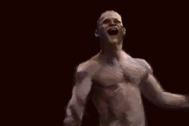
I then used an HSL adjustment layer to turn it to a flesh base color and a few color layers to shift the tint slightly in places, so it wouldn't end up all one simple flesh color. As I did this I was careful to avoid primaries and secondaries - they tend to look cartoonish. So I went more toward tertieries and 'dirtied-up color'. I also was very conscious of the fact that all my paintings until now have weird ugly colors - I tried to make them look better. I kept my brush very transparent for this color layer work, and used a soft round brush to erase the edges so they blend nicely. Also you can see that I used some chalk brush and layered over it with hard and soft round brushes to get a variety of textures and edges. At this point I had lost the brightness of the highlights, they need to be brought back up with a Levels adjustment layer. It was somewhere around this point when I wrote my Christmas day post and decided to start working smooth, so from here I started using a combination of soft and hard round brushes with careful transparency to smooth things out. I was going to just smooth it all out completely, brushstrokes be damned! But I found I didn't need to go that far - by smoothing out to the the right amount I pulled it all together and made it look coherent and gave it a nice sense of surface, without losing the vigorous brush work. n fct it looks much more painterly like this.
I've come to realize one of my worst problems with attempted brushstrokes - I used to set the brush on low opacity and scribble around with it, thinking it would look like brushwork. But it just looks ugly. So now I'm using my brushes on full opacity and then coming back in and making blends by semi-transparently laying one color over the adjacent one, then picking that up and using it to blend at carefully calibrated levels of transparency. For this I use a mix of hard and soft round brushes. I did throw in an occasional chalk or oil brush, but they need to be partially covered to smooth the textures down quite a bit.
For most of my older paintings I tried to be Kent Williams, all loose and rough, but on Christmas I thought about a largely forgotten idol of mine from the 70's - Richard Corben:
For many years I believed he did all his work in airbrush, because that was stated in some comic book and was the only information available until The Richard Corben Art Book came out, when we finally discovered he actually worked in many mediums. For most of his grescale stuff he used various mixes of ink, charcoal and pencil. His really excellent full color work was in oil paint or was done in greyscale and colored comic book style using a system of overlays he invented that revolutionized comic book coloring. Turns out his airbrush work was the stuff I really didn't like - ironic, since I bought some airbrushes and learned how to use them because of him.
Going forward through the 90's in my Alternative period, when I went all dark and gritty inspired by alternative rock and underground comix, I lost my feel for Corben's exaggerated cartooning style and turned more toward the darker, more expressionist artists showcased in Epic Illustrated, including Kent Williams. That's when I decided I'm an expressionist and that I need to always work with vigorous agitated brushwork. That idea obviously stuck, and it was really holding me back in my growth - now I see that I need to smooth things out for learning purposes, and I can doubtless be all edgy and expressionist later. But first it[s important to learn control.
Another important influence on this latest piece is Jeff Watts. He keeps saying not to just copy the reference but to use what you know - fix those weird looking areas and make sure it has a sense of roundness and solidity, which is often flattened out in photographs. Don't just copy shapes that don't make any sense, use your understanding of lights, mids and darks, put in a core shadow if needed, whatever it takes to make it work as an image with the illusion of three dimensions.
I also think it was vitally important that my image had a black background and I put some very nearly white highlights in right from the beginning. Without this, it's easy to get lost and think you're using a pretty full tonal range when actually it's not even close.


No comments:
Post a Comment