Monday, December 23, 2013

Looking back @ 2013, and going forward


This is a screenshot of my Flickr gallery page, showing the pieces I've completed in 2013 (so far - might get 1 or 2 more in yet). Looking at them all together like this several things become apparent :

1) The most recent 2 (lower right corner) stand out because the light planes are much lighter than those of the earlier paintings. I've also created a good strong separation between halftones and shadow tones in both of these (I mentioned this in the last post as well).

But I didn't mention the rest of these factors.

2) The last 2 also look better in color terms. Where I've lightened the light planes they have less color saturation, there's more white blended in. This looks a bit more realistic and less cartoonish. 

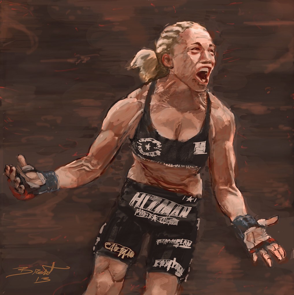
3) In the last one (Charmaine, lower right) I also used color with more facility. Keeping to the carefully controlled values, I freely dropped in different colors - reds, yellows, greens, each corresponding to a different value (so actually not 'freely' as I said). I did this using a Color layer, to change the hue of already existing values, and I changed the color in the color picker by only moving the cursor in the color bar on the side, not by moving the picker inside the square window, which would allow me to change the value (unless I was careful to only move it horizontally of course).

4) I want to move forward using this kind of approach for a while, but I want to get a bit more ambitious and start doing more complete scenes now - figure(s) in an environment rather than standing isolated against a black background. Lol - I didn't do that one on purpose - it's just that these pictures of MMA fighters were all taken in or near the octagon, with bright overhead lighting and a darkened audience area behind.

5) Besides these things I already mentioned I need to work on landscape and composition.

6) - oh yeah, and I also think it's time to do a few male fighters, to start to learn the differences between boys and girls (besides the obvious, obviously).

Thursday, December 19, 2013

Charmaine


Notes :

Starting with my previous piece Ronda, I paid attention to maintaining a clear separation of shadow planes from halftones/highlights (light planes), which gives both of these much stronger solidity and clarity of form. I notice they also both have lighter light planes than my previous paintings, which now look muddied up to me because of it. 

I also noticed before starting on this one that I tend to shy away from greens in flesh tones, and it seems to be an important element in most paintings. So I made shadows green here, and it definitely helped. In fact the flesh tones here consist of purples (or somewhat cool reds you might say), yellows for highlights, and green for shadows. A pretty full set of colors. I normally tend toward mostly warms, with some purples for shadows.

Here's the value sketch before converting to color :


Saturday, November 23, 2013

Catching up

I said I was still going to post finished work her when I get it done, but I forgot to post this one:

Undaunted


And just about a half hour ago I put the final touches on Ronda --


Charcoal magic


A refreshing break from all the unadventurous photorealism and photocopying that you usually see on YT videos of artists today. His work is vigorous and exciting, revealing in the formal elements of art in a way reminiscent of Cubism and other Modernist methods. There was a sense then of getting something besides just the pure physical form of a thing, something other than pure materialism.

Tuesday, November 12, 2013

They play well together


I realize now that it isn't a matter of choosing either constructive or direct drawing techniques, but of learning both. It's a false dichotomy - each one really complements the other and to reach the highest levels of drawing competency you need both sets of skills. The meticulous observation and the quick gesture are both necessary components. Interesting, because at different times I've been a proponent of each, and thought of them as opposing forces that can never merge. But to become a complete artist they must merge.

Sunday, November 3, 2013

Ahh -- Conceptual Figure Drawing... so THAT'S what it's called!!


Recently I wrote about the 2 different approaches that I know of to classical  figure drawing -- the Atelier method which involves directly copying shapes precisely (I'm not sure Atelier is actually the right term anymore) and the one favored by Glen Vilppu, Hogarth, and the like, which involves analyzing the pose, drawing it in terms of gesture and then basic forms and casting light on it from an imaginary source. Well, I've learned the name for it -- guess you already saw it in the title. But for those who don't remember and are too lazy to look back up, it's Conceptual figure drawing.

Here's a video from Proko.com where the god of figure drawing Glen Vilppu demonstrates some excellent techniques:


Seeing this was the inspiration for my above sketch. Conte pencil on newsprint, and in the 2nd state rubbed with a finger and heightened with white.

** Ok, apparently the name of the method where you copy exactly what you see shape for shape and tone for tone is Direct drawing. Makes sense. I think some ateliers teach the Direct method, some teach the Consceptual, and some might teach both.


*** New info added 11-5 ----


Just learned a couple more terms for these two different approaches. Direct observational drawing (and painting) is also called the Academic or Illustrative approach, and Constructive figure drawing can also be called Conceptual or Analytical, since the artist is analyzing the model and then re-conceptualizing it.

Monday, October 28, 2013

I'm on Conceptart now

I've re-activated my old forgotten Conceptart.org account from 2004 and started a new sketchbook there, as well as launching myself into some serious artistic training, beginning with 20 daily gesture sketches via Quickpose.com.

This is like boot camp for artists - if you're serious about learning CA is the place online to go.

My sketchbook there has pretty much supplanted this blog as a daily or near daily progress report. But I'll still post my finished pieces here when they roll in.

Tuesday, October 22, 2013

Got started back to work on Longbow today..


Click back and forth between them in Lightbox or whatever it's called to see the differences.

Monday, October 21, 2013

Look at this limited palette cover work by Kent Williams..


Similar to the Mark Behm video I posted recently, but it's pretty obvious he used much brighter colors than burnt and raw sienna with black and white. Looks like a pretty powerful yellow and red, maybe both cadmium? And black. White too, or he couldn't have got that flesh tone. Then something blue - can't tell what kind of hue. Or maybe the cool purplish color in the bg was mixed from his red and black? I'd like to try to do something with a similar palette. That really low chroma palette I just used was making me feel kind of restricted, though I must say I was amazed what I was able to do with it, and it really did demonstrate to me that you can use blacks or grays to cool a color significantly and it helped me to get cools and neutral grays into the flesh tones.

Sunday, October 20, 2013

Started posting on deviantART today

After trying to connect with Conceptart but finding it's down again. Seems to happen a lot. I checked "is conceptrart.org down?" - there's actually an online service that you can check for balky sites to see if the site is really down or if it's on your end, and there's an endless list of recent and old comments there from people complaining because it goes down so much, and apparently the format has changed and the forum isn't nearly what it used to be (some peoples' opinions anyway).

SOooooooo.... I went over to deviantART instead and submitted Victorious and Spearpoint Diplomacy to the account I created there 4 years ago and have never used. And I didn't bother to snoop around first and check on how things are done round those parts -- lol, hope I didn't break any norms..

I'll put my deviant page in the sidebar (*if I can - it won't let me post a link to my Flickr set of drawings and paintings.. )

* I discovered it will let me edit old links, so I swapped out my Luca Cambiaso and Ubaldo Gandalfi links for my devianART and Flickr pages instead. Man, talk about downgrading..

Saturday, October 19, 2013

Victorious finished


Full size on Flickr -- download if you want. Once there, click on the three little white dots down in the righthand corner and then on View All Sizes.


Welcome to my studio!


WElcome to new readers who might have found this through my other blog. I've decided to finally make this one publicly visible, after almost a year of being private. It's a very special day - I've moved my studio up from the cramped space behind the animation table in the basement into a spare bedroom with two windows (one with a northern exposure even!) so I can put a fan in one and get a good cross-ventilation going. Plus I now have room to move!! And new studio equippage - detailed in the last post. As you can see I've moved lots of the paintin' stuff into its new legit home. This at a time when my painting is starting to look pretty good - so it really is going legit!

Friday, October 18, 2013

Wow the table easel came in already!!

Wasn't expecting it so soon, not till next week really, but it was on the porch this morning. Here it is, along with the new drawing table and chair:


Together the easel and table make a really nice studio easel type of setup, although it occurs to me, that one thin slat of wood extended downward will have a lot of pressure on it - especially considering it has a big slot cut up the center of it. It does seem very well-made though, looks like it will hold my brushes in the side drawer. And what I like about this setup that no studio easel I've ever seen allows, is that I can scoot my chair in and get my legs right in under the painting. No leaning forward, putting pressure on my lower back, and extending my arms out in front of me all day killing my shoulders/traps. If this ever breaks, as seems likely with just one clumsy knee-bump while scooting the chair in or out, I'll make one that doesn't hinge open and closed and that doesn't have the ability to extend the bars up and down - just a fixed-position, rock-solid version without the folding/travel functionality, and with much stronger wooden supports - probably several of them rather than just one thin one. Ah, it's going to be sooo good to break out of that tiny confined little space behind the animation table in the basement, and to sit on a nice comfortable chair while I paint! In a room with ventilation even!! Not to mention the coveted Northern exposure!

I got this easel on Amazon for about $50 - saw the exact same model on Jerry's Artarama for about twice that and was about to buy it when I decided to check on almighty Amazon. It's the Ravenna Table Easel with Drawer by Art Alternatives.

Thursday, October 17, 2013

Converting value sketch to color...


Painting is well underway now. So far I've used only the palette Mark Behm was using in that video clip - burnt sienna, raw sienna, black and white. I captured color swatches off a Dick Blick page of oil colors, pasted them together to make a single image, then opened it in photoshop and used it to pull colors from. Then I made a palette as a separate image where I pre-mixed swatches... aw heck, easier to show you:


I just added the blue-grey background to make it easier on the eye - the BG is actually white so as not to screw up colors I mix over it.

I did start with these colors, but they've been modified many times via adjustment layers and different types of blending layers, as well as a warming filter over all of it. I can see though I;m going to need to add a couple more colors. I don;t think this is a good palette for me - I need stronger colors. And this might be a bit off - the burnt sienna looks kinda purple to me.

Preparing to switch over to Alkyd paint. Thanks Wacom, now I know I can do this!!

I'm so glad I decided to get a tablet, and that I stuck with it even though in the beginning I sucked terribly with it. I remember trying to draw a necklace on an old Fafhrd head I had done originally in oil pastels, and I couldn't get my highlight line to sit right next to the shadow line. Now that I'm so used to the stylus I can do stuff like that super easy.

This gives me immense confidence that I;ll be able to handle paintbrushes after futzing around with them for a while too. I had myself convinced for a good while there that I:m just not cut out for painting, I'm used to drawing media instead. But if I can get used to the stylus to the point where I kick ass with it like I do now, then I can do the same with paint. I plan to switch over once I;m set up for painting, and spend all day every day painting the way I've been doing with the tablet (though Ill still work out my drawings on the tablet first).

Also my tablet work has helped me to work out my painting method, because I'm doing it exactly the way I will in paint - develop the original drawing into a value painting, then work in color. Ah, the old traditional separation of drawing, modeling and coloring! Ya know, those classical master guys were pretty smart cookies!!

Oh, and I just ordered a nice little tabletop easel with a bar that extends downward off the front edge of the table so the painting is right over your lap. This should be perfect - I always did my drawings on my lap, either on a drawing board or a pad. It's how I want to paint too, no need to hold your arms extended way out in front of you all day while your shoulders burn and your back aches. I still remember how painful it was when I did the paintings from earlier on this blog. I was planning to put my canvas or canvas panel on a board sitting on my lap and lean it against a table - that's exactly why I bought the drafting table (which came in yesterday, along with the chair - wow, next day delivery!) But this will be just as good, and should give me a bit more freedom since the painting isn't actually sitting right on my lap. But I love the fact that I can pull my chair in and get my legs way in underneath it - which I don't think most floor easels will allow.

Pics coming as soon as I get the easel and get it all set up in my current bedroom. I'm moving the bed into its new home today and expect the easel early next week. I just couldn't take another 6 to 8 hour session crammed into that tiny space behind my animation table sitting perched way up on that extremely hard uncomfortable high chair. I also have very bad memories of long periods of time spent pre-mixing colors, many of which I ended up not using anyway. No more doing that either!!

Super limited palette


Ran across this little gem the other night - talk about a limited palette!! He used only black, white, and burnt sienna. No real cools at all, except for the black I suppose. I need to try this. ** Note - he usually uses this palette plus raw sienna, which is yellower. It looks like he has some raw sienna here - maybe he just forgot to add it to the description? Anyway that sounds like a much more useful palette.

Ok, it looks like the greys are very cool in comparison with the warm sienna. I love the way he only used a couple of brushes, all flats and brights, and used the corners for details and lines. I also notice he doesn't use different brushes to blend, he seems to just keep using the same brush he was just painting with, not even cleaning it first. I guess you develop a feel for when most of the paint is gone and it's ready for blending. Looks like Burt's been putting on some weight..

Tuesday, October 15, 2013

TripleVictory


Here you see my original pencil sketch followed by scanning it in and working it over with the tablet. It's actually kind of scary how much better I am with digital aid.. if only I could use the transform tools and liquify filter on paper! Though I know if I stick with it I can improve my pencil work drastically -- it's just been a long time since I was really in practice. One thing I notice though - working on the tablet is a lot more like painting, using wide swaths and patches of value rather than lines. I suppose drawing with charcoal and chalk would be similar. But eventually I'd really like to improve my spacial awareness and eye/hand coordination to the point that I can draw it right the first time, without needing all the modification. And you do that by drawing - probably without the safety net the tablet affords.

For now I think I'll keep working like this - sometimes starting with pencil, sometimes doing it on the tablet right from the get-go. Then I'll project the drawing up on canvas and paint it up. I've just ordered a drafting table and chair plus some scrubs and a lab coat to save my clothes. I'll be setting up shop upstairs in a spare bedroom with 2 windows so I can get some ventilation going and hopefully avoid the strokes Frazetta suffered.


Here it is a little more finished. Enough for tonight.

Sunday, October 13, 2013

Cyborg finished, and crits


Comments and crit on my latest couple of pieces..


In some ways I think they look great, but then they're just really exercises in copying from a photograph with minimal changes. On Cyborg, I feel like it looked stronger in the early stages - more painterly with rough edges -- you could really see the hand of the artist. But somehow as I added in all the little highlights and finishing touches it all smoothed out until it ended up looking kind of generic - almost like a photograph. Ok, not entirely, but more than I really want for my work. I should have gone bolder on colors, darker on shadows. Harder on some edges. I also need to get some blues and greens in the flesh - the purples I:m using are just too warm - need to cool it off.

Ahhh, really  though, I guess I'm talking about how I want to progress from here. When I look at the painting, it does look pretty good really. One thing though that I wish I had approached differently - I mean it's freakin' Cris Cyborg -- and I made her look almost like a pinup!! At the time I had no idea who she was, it was the only picture I had ever seen of her, and it actually did make her look kind of cute. It was when I decided to include the tattoos I had to research who she was and look up better pics - then I found out what she's really like. Now I wish I had done her brutal and fierce. I think I'll do another one, maybe a few drawings too. Thanks to doing this painting I've learned about the gritty grimy world of womens' MMA fighting. I'm fascinated. Hell, Degas did the ballet - Lautrec did the circus and the nightclub scene - I think I might do the MMA world for a while. It'll really help with my learning the anatomy.

MOre in general - I think I need to switch away form the tablet now. It finally allowed me to paint successfully for the first time as far as I'm concerned - and I've developed this system (sketch, adjust it, value drawing in monochrome, then start working over it in color). Now it's time to do it in paint on canvas. I think the value drawing method is what's going to get me through - it's underpainting.

Also, I want to stop copying the exact shapes I see in a picture and instead strike lines to the bony landmarks. Need to refresh my memory on them a bit from the Hale books.

Monday, October 7, 2013

Cyborg


Notes --

I love this way of working from reference - but block in roughly and then keep carefully measuring and refining as you go. I used dividers right up against the monitor for comparative measurements, and also held a pencil to get the angles of lines, then slid it over keeping it as close as possible to the same angle.


Above is yesterday' progress (oct 8). Didn't do much work the day before because I was in a sleep deprivation funk - trying to switch myself to a diurnal schedule. Below is today's:


Saturday, October 5, 2013

New exercise - working from reference now

Jeff convinced me - and besides, I remember how strong my drawing got back when I used to draw from ref all the time. I was super stressed at first, but decided to quarter off the image and just block in. Amazed how well it worked..