This is a personal journal documenting my studies in art - mainly just a place to keep notes and to organize my thoughts better than I could in a handwritten journal (you can't do a search in a paper journal, or post live links). My ultimate goal is oil painting, but I want to start with developing my grasp of the basics in drawing.
Saturday, April 15, 2023
Back At It!
Thursday, April 13, 2023
Some thoughts on recent posts and what I'm doing
It's starting to hit me, what I'm doing here. I've been talking about this group of artists who were active starting in the 60s, when I was a kid, up through the 90s, when I stopped being interested in comic books. And I'm comparing and contrasting them with each other and with my own art, ferreting out the influences they've had on each other and on me.
It's somewhat like doing master studies, where you pick an artist and copy a piece of his work. I've done a bunch of them for the Level Up course when I was on ConceptArt. Seems like a lifetime ago, it was about a decade I guess. Here's a few I did:
But what I'm doing now is much more focused. I'm looking specifically at this group of artists who so profoundly affected my own ideas about art as I was growing up. That's formative stuff! These guys plus a few more were it for me, well in the comics world. Then there were more of course. Right now I'm specifically looking at my comic influences. Not really sure why, it's an intuitive thing. I'm really drawn to it, and I suspect it's because they offer what I'm most missing in my work, those powerful shapes and colors and textures to bring some toughness aqnd personality to it. To pull my work out of blandsville and turbocharge it. Well, that plus of course I moved to comic figures to propel my anatomy studies.
By looking at all of their work rather than just examining the work of one artist, and generally it's one who lived a century ago or more (not always), this gives me a very deep and broad understanding of certain things. I see the diffferences in how they approach things, and the similarities. That helps you to guage things to a much finer degree, to see things you would otherwise have missed. Simply because I looked at a bunch of Texeira and then a bunch of Jae Lee, and before both of them I did a stint on Bisley. Grabbing images and video to post made me begin to notice these similarities and differences, and drew my eye to trends that were developing or being refined in ther work as it evolved across the decades and through all of them and several other artists who were peripheral to their group (not that it was really a group, I just group them together as stylistic influences on each other).
One thing I notice about all of them—They combine two things that don't frequently go together. Ultra-juvenile musclebound superhero fantasy with bulging biceps and sexy women, alongside some really sophisticated art techniques. It's always there, if you defocus on the bulging muscles and grimacing faces and sweat. Each one of them is a master in several techniques that most of their peers just didn't even come close to. Compared to the normal run of the mill comics artists, each of these guys were truly great artists. There's a solid character and personality in their figure work that's mostly lacking in the work of the general comics artist. I could do a post of a series of them comparing them with some of the weak-sauce artists of their time, but that seems counterproductive. And it would be a lot of mudslinging, what's the point of that? Oh, there were definitely some other great artists at the time, for sure! In very different ways from these powerful stylists I'm focused on. They were the superstar artists, and then you've got the lower-tier, the workmanlike artists who drew stiff figures that never really seemed solidly grounded in the scene, or just didn't have graceful gesture to them.
Some of these guys have the same problems actually, but their style is so powerful and they're so bold in their choices that it doesn't matter. It's when the artist is also tentative or too timid in his choices that you notice those issues.
Design—strong vs weak shapes (and colors and TEXtures too)
Scrolling down my blog after finishing the most recent post, I noticed some things. One of the biggest differences between my drawings/paintings and those of the powerful artists I've been blogging about is the shapes they use. They're powerful and expressive, whereas mine are weak and smooth. Soft and gentle.
Self-critique:
Not only the shapes, but the colors and textures are far more powerful and eye-catching in the Jae Lee piece. Of course it's not a perfect comparison—his is intended to be mega-powerful and badass, while mine was an anatomy learning piece and I wasn't going for anything of the sort. But in general my drawings do tend to be bland and gentle. I don't want them to be as crazy or savage as that one, but I do want to move in that direction, if just for learning purposes for a while, to overcome what I see as some of the weaknesses of my drawing. It can be very helpful to try out different approaches, techniques and styles, even if they aren't necessarily the way you plan to end up working. It all contributes to the gestalt of your art.
I can see that more jagged shapes, rugged and chunky lines, and moving away from pink for a flesh tone would make my dude look a lot tougher. In fact next to Chapel he looks downright feminine.
To crit the other way, mine looks more realistic. But then I can guarantee I put a hell of a lot more time in too. Because I was in a learning phase and struggling, and he was way beyond that. He had his techniques down pat. And was practically copying a Bisley piece.
But I do see the importance of the way I've learned to lay out the anatomy now, as opposed to back then. Now I understand how the muscles wrap around the body (in places) and fit into and against each other. Back then I didn't grasp those things. As soon as I can bring some of that method back and fit it together with the way I draw now, this is gonna get good!
And suddenly I get it—diagram the muscles out the way I've been doing, with smooth simple curved lines, and then on top do another pass, drawing in the muscles more chunky and with cool shapes. Man, I was really starting to feel bad about blogging about nothing but other artists, when it's supposed to be about my art (at least sometimes), but this is really getting good now. I'm developing my ideas on how to proceed, rather than just drawing the same stuff over and over without making any progress.
* * *
I just scrolled down my Drawings gallery on Flickr, and I see it isn't all my drawings or paintings that are smooth and simple like that top drawing. It's only the learning pieces where I was drawing form, as opposed to putting a surface on it. Like these:
Wednesday, April 12, 2023
Influence Tree
What was so powerful about this image is the convergence of the composition, the slightly comical aspect of the figure, but without sacrificing his heroic aspect, and the cool color palette. I saw all of that at once. It was my first experience with getting a mental image and knowing I needed to draw/paint it. The next time I remember that happening was here:
I seem to have myself primed for another such experience. I'm getting pretty sleepy, maybe I need to look through a big pile of comic books before I drift off...
Tuesday, April 11, 2023
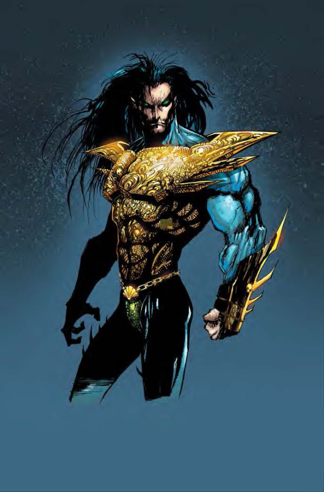
How did I never mention Jae Lee?
He's definitely another of my favorite of the crazy 90's comic artists, standing along side Mark Texeira (who I talk about all the time). The 90's were the decade when everything had to be extreme, and these guys were as extreme as it gets.
![]() |
| In this drawing of the character Chapel you can see a strong Simon Bisley influence |
Unlike Texeira though, when I look at Jae Lee's work, I don't see distorted bodies so much as the pure essence of these characters. It's like you're seeing their spirits or thri souls, rendered symbolically to show you the intense energies raging inside of them. The narrator in the video mentioned they look like demonic mosters, and that's definitely true. In the 90s comics followed where movies and pro wrestling had led, away from good-guy heroes, through antiheroes, and into a space where there are no heroes anymore, or rather you can't tell them from the bad guys. They're monsters. They had all become monsters. And in comics like those of Jae Lee and Mark Texeria even the 'good guys' are violent and destructive. It's just that they only unleash it against the really tyrannical sadistic monsters that are the bad guys. I think the idea was "It takes a monster to fight a monster." That concept has always been there, if often subdued, in stories involving heroes and villains.
This kind of art (in which I include both Jae Lee and Mark Texeira) could only happen in a post-Frank Miller, post Sienkiewicz, post Walt Simonson world—those guys I spoke about recently who had to restrain themselves through the seventies and part of the 80's and were finally freed to do the more powerful, modernistic, and exaggerated art they had always wanted to do. That laid the ground work and allowed for the next generation to push beyond, culminating as far as I'm concerned with Jae Lee and his crazy explosion of pure raging testosterone-fueled expressionist nightmare imagery.
This kind of art and this whole business model for comics topped out and apparently burned out somewhere in the mid to late 90's. I can't really say what happened, I lost interest around that time and stopped looking at comics. The last thing I remember buying in a comic shop was the 4-issue Sabretooth miniseries drawn by Texeira that I posted about recently. I don't think I even went back into a shop after that. I can't say exactly why, I think it was burnout or too much extremism. They had pushed it all so far it became too much. You can't just keep going in such a crazy destructive direction, and how do you come back down from it? I don't know how they did it, I just know everybody seemed to lose interest in this over-the-top stuff around the same time. Maybe the times they were a-changin'.
Maybe the artists couldn't sustain that kind of intensity and extreme distortion for very long. Nor could the readers. Extremism tops out and fades, or it explodes and then people have to start to rebuild from the ashes. The few times I tentatively peeked in at what new comics looked like afterwards (years later) I didn't like what I saw. No more extremism, no more testosterone-fueled monsters raging at each other looking like inflated bodybuilders on steroids or Asian demon spirits. Drawing styles were either uninterestingly realistic or insipidly cartoonish, often with a strong Manga/Anime feel. And when I wanted to see some comic book greatness I had to pull old issues out of the boxes or look up videos about comics from the 70s, 80s and 90s. Or more recently buy Omnibuses or new collections in paperback form of old runs, usually printed on nice slick paper with reproduction values far better than they were originally printed with (on that crappy newprint stock).
His backgrounds were often non-eistent, which makes the comics 'read' very fast—you can quickly see at a glance what's happening, and it helps your eye move around the page rapidly. And when he did draw backgrounds they were even less realistic thean the characters. They were pure expressionism, like something form The Cabinet of Doctor Caligari or Metropolis.
Tuesday, April 4, 2023
The Texeira Emulations
This was the first time I deliberately tried to draw like Tex, or at least the first time I felt I was successful. I might have tried a few times before and failed miserably, but here I hit on the right combination of techniques (which I wrote down in the corner of the page). The really crazy thing is, I did this directly in ink using dip pens and brushes, with no pencil guidelines underneath. I seem to do some of my best work when I go in without a net like that (not always, sometimes it's a disater).
Monday, April 3, 2023
Distorting complex forms three dimensionally the Texeira way
Tex does far more realistic heads/faces than most comic artists. Not totally realistic, but built on extensive knowledge of skull structures and muscle structures that give shape to the face and to expressions. But not necessarily drawn 'realistically'. Having that knowledge lets him construct the face from forms, and he can do things you can't if you copy photographs etc. He builds the faces from those inner structures, really from his own understanding of them in three dimensions. So again, as with the body, he can exaggerate in many different ways and push beyond realistic boundaries. Those mouths that open farther than any human mouth really can, sometimes with extra teeth in them, for instance.
In the image above it's clear he understands the skull structures the head and face are built on.
He's obviously drawn a lot from photographs after developing all that in-depth understanding of the forms, and extrapolated/extended what he actually sees. Since he understands the construction of forms like the jaw hinges and the bunched muscles around it that give shape to a smile or a frown, he can push what he sees in ways other artists simply can't. And I'll guarantee you, when he draws from photographs, it isn't a simple matter of copying the shapes and tones that he sees. He interprets what he sees, infers things that can't be seen, and builds a head, visualizing it all three-dimensionally, based on what he sees. I know, because I do this, though my own understanding is nowhere near as extensive as his. But this is the beauty of constructive drawing. It teaches you those forms and how everything under the skin interacts to create the lumps, bumps and hollows we see on the surface of the body. And it gives you power to manipulate what you see, and to change it however you want to.
I'd say what he really has developed is a mental mannikin of the human figure in great detail, with full understanding of its anatomy down to the skeletal level, and it's distorted the way his drawings are. Or he can distort it that way when he wants to, though his figures when they're really distorted are fairly limited in their movement. He seems only able to draw them in a small range of poses that way. And his particular methods of distortion seem to slip at times. You'll sometimes see a different kind of distortion for a panel or two, and then his usual method comes back. He was doing this in the 90's when everything had to be extreme, and comic book art in particular. Many other artist were doing similar things.
I have no interest in drawing such intensely distorted figures, and I don't want to distort the same way he did. But some of my favorite artists work this way. Learn the structures and anatomy and proportioning of the human body so well they can distort it from the inside—3 dimensionally. Meaning the skeletal structure itself gets distorted, as opposed to those cartoonists who don't really know the skeleton, so when they distort there's no sense of one underneath the flesh, creating that chassis or framework on which the muscles are anchored.
Ok, I guess I ought to put my money where my mouth is and show what I'm talking about, though most of my minuscule audience probably already knows this.