Thursday, March 23, 2023

My favorite artists all have unique individual styles

 Most of the artists I post about in here—maybe all of them—are what I would call stylists. By which I mean they rock the boat. They don't try to draw like anyone else, or in a house style, they all developed their own very unique styles and it really stands out from the crowd. And when it comes to the comic book artists, I believe all of them ink their own work. Not always, but you can really tell when somebody else inks it, and it's a loss in quality usually. I take that back—when it comes to Marc Silverstri, his best inker is Dan Green. They developed a synergy together that few teams have had. 

Today my Punisher trade paperback came in. If possible,  when it comes to artists I really like such as Tex, I try to get their work in reprint form in something like a trade or a collection or an omnibus. The problem with the omnibuses is the paper is super-thin, seems like it would tear or crease really easily, and the books are unbelievably massive. I like to hold a book in one hand in my lap and page through it with the other, and after a while if it's an omnibus, my wrist gets worn out. I mean these books weigh like ten pounds!! But it's an excellent way to collect an entire run by an artist or a writer, printed on nice slick paper with bright colors (sometimes inappropriately bright for the subject matter). But I didn't have to get an omnibus to cover Tex's entire run on The Punisher. He only drew a few stories in that title, so just a trade paperback covers it easily. 

I plan to shoot pictures from the book and show the work of a variety of Punisher artists who work at different points along the spectrum from pure house style to one-of-a-kind stylist like Texeira at his peak. That'll probably be my next post, in this one I want to cover some different territory.  

All my favorite artists have developed a very individual look and visual language and an unmistakable style of their own. I want to talk a bit about how they've done that while working in an industry like comic book publishing, which for a long time didn't allow much individualism. Or I should say it didn't allow a more modern artistic approach. Individual style was fine as long as it was close to the classic Marvel house style, which in the early days (up until somewhere in the 70's) was the Jack Kirby style. 

There were several artists working in the bullpen who wanted to break loose and do something very different—Frank Miller, Bill Sienkiewicz, and Walter Simonson that I can think of offhand. I know Miller, and I think Sienkiewicz, would continually ask to be allowed to cut loose and try something more experimental, but they weren't allowed to until they had spent a good ten years proving themselves worthy and loyal to the brand by doing good workmanlike work. Often in their early stuff you can see hints and allegations of what was to come here and there—a few more loosely-rendered figures, an interesting compositional choice,  etc. But their editors would reign them in and not let much of that slip through. 

I'm not sure when it was exactly, but I think some time in the 70's they did start allowing it. The first stories I remember seeing in an innovative modernist style were Simonson's Metal Men comics. It was not a highly popular series at the time, probably failing, and I think he was put on it and allowed to do his thing—that modern comic thing he had been wanting to do for a decade or more—in order to field test it and see if it would be accepted by readers. Personally I loved it,  and a lot of other people did as well. It really stood out from all the other titles on the spinner racks in the grocery stores in those days (which is where you would buy them. Comic book shops didn't exist until the 80's). I believe his work propelled Metal Men to a new level of popularity and generated loads of letters from readers asking about him and this exciting drawing style. 


So after some time they let him do short Manhunter stories at the end of one of the many Batman titles. This is how DC would try out new series ideas and artists. Interestingly, like the Punisher, Manhunter used guns and other lethal weapons like knives and throwing stars. Even more interesting, when Batman debuted in the early 30's, he would use a tommygun sometimes, and had no qualms about killing. It was the Comics Code (censorship) that put an end to that, and now most people think Batman was always a paragon of non-lethal morality. Nope. 


Then he went back to Marvel (most artists, writers, editors, colorists, etc would jump between publishers from time to time) and they not only let him take over drawing Thor, which was flagging badly at the time, but they let him completely revamp it. He not only penciled and inked it, he took over the writing too, and had massive ideas about how to reboot it. It became a huge success story. 


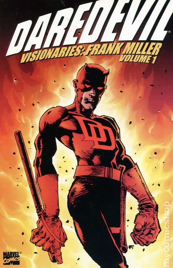
Meanwhile Frank Miller had been doing the same thing—cranking out some pretty standard house-style work for a decade or so, when Marvel let him take over writing and drawing on the sagging Daredevil series


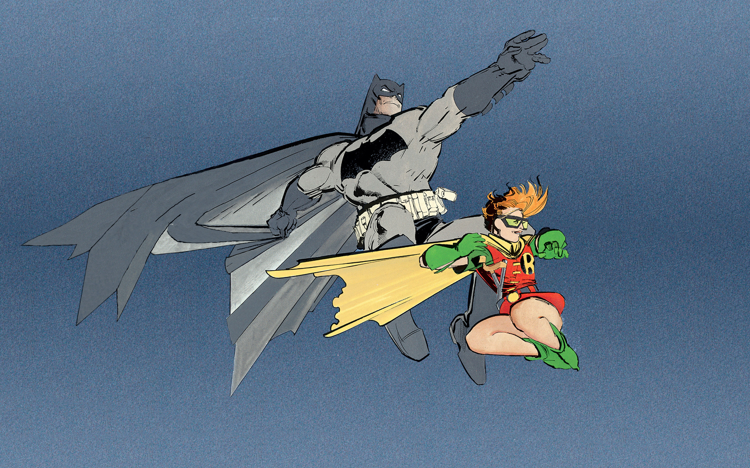
Then, when he became a superstar, DC let him do his flagship Dark Knight Returns (basis for the movie The Dark Knight). These artists were largely inspired by some of the European comic work being done in publications like Metal Hurlant (the original French version of what we know as Heavy Metal magazine here in the states). Europe was always way ahead of us in allowing and encouraging strange innovative artistic styles.  


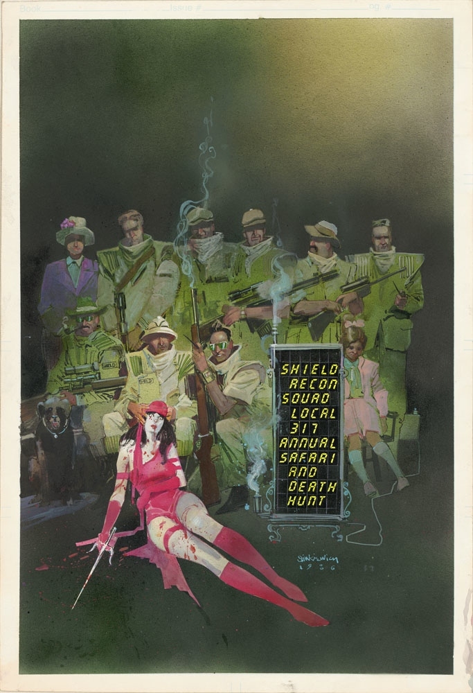
Which brings us to Bill Sienkiewicz (it's pronounced Sin KEV itch). He did the house style as well as he was able until one day they let him start to cut loose while working on an X-Men spinoff called The New Mutants.


And then Elektra: Assassin, which was a Daredevil spinoff, written by Frank Miller. He did much of it in fully-painted panels like the one above, but at times switched to drawing, and often it moved into extreme caricature, something he's known for and really good at. It was all very eclectic and innovative. 

The big lesson I want to get across with this post is that they all put in their time grinding at the basics of drawing effective comic book art for a decade before cutting loose. Some of them may have been ready sooner, but I believe it's necessary to learn the principles (aka the fundamentals, the basics) and then get in those years of good solid work without any attempt to be innovative or develop your own style, before you cut loose. A style develops on its own, it isn't something you force or push. Many students use "It's just my style" as an excuse for not having learned the principles when getting their work critiqued. Style comes in after you've done your ground work and put in that early effort. 

Yes, I've emulated each of these artists at times, some more than others, but it was never with the idea that I'm going to draw much like them. It was always to learn what I can, especially about the way they draw or paint. Emulation is important in the learning process, but hopefully it's only one part of a nutritionally balanced meal. 

Mark Texeira Sabretooth


Rather than take a bunch of pics I'll let the Kayfabers do the honors once again. I promise my blog isn't going to be just a Comics Kayfabe stream. After the last post I wanted to go ahead and show Tex's best work IMO. Getting some serious inspiration up in here, and then I think I'll post some of my Tex-inspired stuff from the 90's sketchbooks. 

Tuesday, March 21, 2023

Let's look at some Texeira Punisher, shall we?


This is Tex at the absolute height of his abilities IMHO. I've always preferred his ink work to his painting, though that's nice too. But his real genius as far as I'm concerned is with those monster-thick brush strokes against the fine line work. Chunky and yet in some ways delicate. 


After that Cartoonist Kayfaybe video (2 back I think) where they showed the Texeira stuff right at the end, I hit up Amazon and bought a bunch of his Punisher work. I had never seen any Punisher comics before, much less by Tex. They've been coming in now for 2 days,  and there's a range of levels of work here. This is from one of the earlier issues. I can see his trademark style developing already, but it's still midway between a pretty standard Marvel house style from the late 80's and the amazing style he would have on his Wolverine and Sabretooth books at his peak. It's exciting to see his work develop like this! Almost page by page. I'm not sure, but I think he was doing the Punisher right before breaking out into Wolverine and then Sabretooth. So this is where he really started kicking it into gear. 


The rest of these are from a few issues later. Now he's only a hair's breadth from his peak. 


Clearly he works from photos for some of the faces, and he also occasionally does celebrity faces—something he's pretty good at. I don't know if this is anybody, but it's definitely from a picture. No way anybody could do that straight from the imagination! Not from a low angle like that, and with such full 3 dimensional depth to the bone structure of the face. He's so good with smiling female faces. 


I'm almost sure he used likenesses for some of these faces. It seems he often does for recurring characters. I remember him frequently making Wolverine look like Clint Eastwood in some stories. But I don't recognize anybody here. Unless... is that a very young Clint, in the lower left corner, somewhat distorted because I couldn't get the comic to lay completely flat when I took the picture? Not sure, but it could be.  


Just for comparison, here's a spread from one of his Wolverine issues from sometime in the 90's I believe. Not only Clint,  but a few more celebrity faces thrown in too. 

Sunday, March 19, 2023

Fascinating discussion with Peter Chung


I don't think I've ever seen an interview with him before. Apparently there aren't many. He's always been extremely interesting and his designs catch the eye. Aeon Flux was apparently the first adult-level animation show, I didn't realize that. He says most people, even in the industry, seem to think 'Adult' in animation just means sex and violence (I've always considered it more juvenile really), but he used it as a way to explore themes that don't rely on the simple good vs evil or good and bad concept. He says he read a lot of Dashiell Hammett, where often you're made to believe at first that the protagonist's motives are for one reason, for instance that he's a 'good guy,' but you learn they really aren't. I went through a big Noir phase a year or so ago, mostly watching a lot of the movies, but I also bought some books of Noir fiction. Haven't read much of it, but I know Hammett is considered one of the best writers in the field, and he and a few others like Hemingway (who actually wrote a lot of Noir) are considered the ones who transcend it and reach literary levels. It does seem like reaching adulthood means largely loosening up on those moralistic ideas of good guys and bad guys and realizing that, as Chung said, people don't so much try to do what they think is good, as they seek justification for their pre-existing ideas. Something like that anyway, I probably messed up the wording. Or in the words of that great philosopher Dave Mason—"There ain't no good guy, there ain't no bad guy. There's only you and me and we just disagree."

Then later some really interesting talk about the process and business of animation, and of how at the mainstream end of things there are people hired to only find ways to restrict what you can do, and they don't feel like they're doing their jobs unless they find things in your work and say "These need to be edited out." 

And toward the end they talk about why the comic book format (panels arranged on a page for viewing in a very specific upright format) remains unchanged now that we can see them on screens, many of which are designed in a landscape format for movie viewing. And also why aren't there "Director's cuts" of comic books, where you can click to see only the pencils, the inks, the thumbnails or layouts etc? 

On comics being 'the best of both worlds' (written story plus visual art) I always wanted them to be that, but I always realized they aren't. There's really no good way to intersperse words and pictures. You've got spot illustrations, full-page illustrations, and then various kinds of comic strips and comic books, and no matter how they're arranged, I find you always have to switch from one mode to the other, from looking at pictures to reading words. Partly it's a switch from left brain to right brain (that's a bit of an oversimplification, but you are switching between different brain apparatus), but it's just a very different way of taking in information. You have to put one on pause while you switch to the other one. And your brain just doesn't interpret them using the same structures and processes, so it's always jarring. You get a more pure experience from movies, where the story is entirely conveyed through visuals and audio, or pure written words, where visuals etc are entirely formed in the mind of the reader by hopefully evocative writing, or by just a single image with no words, or possibly a group of images. This is why I gave up on any idea of making comic books back in the 90's. 

Friday, March 17, 2023

Loosen up Buttercup


Ran across another great video today I have to post about. In some sense the way this guy draws reminds me of my 90's Alternative Period, but much looser and more flowing. What he's doing is very different from typical 'gesture drawing' approaches, which emphasize dynamic poses and explosive energy.  His tend much more toward the tranquil and relaxed. Elegant even. 

I really like what he says about drawing these long flowing lines rather than short tightly drawn line segments, a bunch of them connected together to make a curve (which is probably a lot closer to how I currently draw). He says each time you stop and start a new line segment your brain has to fire new neurons, which makes it all feel disconnected and disjointed or something. Wow, I never thought of it that way. But I do know I got a very different result using my Trusting Line back in the 90's than I do now, when I'm obsessively concerned with anatomical forms and the blocks making up the figure. I need to go back to trusting. Maybe not always, but I at least need to draw this way sometimes to develop fluidity. It reminds ms very strongly of some of Frazetta's loose sketches, which I love. Let me see if I can find a few of those to drop in here:


He did this especially when he was drawing jungle cats or animals, but also often with human figures as well. 

I think in order to do this you have to really understand the forms and figure and gesture of what you're drawing. And, as the artist in the video repeatedly said, draw from life a lot. Not necessarily human models—animals and statues and objects will work too. Just practice drawing with loose flowing lines a lot. It's clear using long curves creates a very different kind of drawing than a bunch of tightly-rendered blocks and tubes. 


Thursday, March 16, 2023

Making the Connections

Cartoonist Kayfabe covered some Simon Bisley Dredd today, and at the end they busted out an old Punisher War Journal with art by Mark Texeira. They talked about the connection between them, that I had never realized before—basically they said Tex undoubtedly had a strong influence from the Biz.* It was a forehead slap moment. Of COURSE he does!! As does Bill Sienkiewicz (or was he already around in the 80's when I think Bisley got his start? Not sure).

This all fits a few more pieces of the puzzle together for me. Bisley got his main inspiration that I'm aware of from Frazetta and Corben, and then he exterted a powerful influence on the next generation of artists working on the periphery of mainstream comic art. I say periphery because none of them really did the standard Marvel or DC style stuff, they were outliers like Frank Miller. 

And they all have something in common, something that I want to develop myself. Well, not Miller really, but the rest of the ones I mentioned—

A solid understanding of proportioning, anatomy and figure drawing from imagination. 

It's clear to me they all practiced it enough that the knowledge became ingrained, absorbed into the unconscious. In fact deeper than that—I've heard it said that the things you practice the most get written on the spinal cord. No thinking required, it's instant access.

You get this effect if you drill repeatedly for years on the same moves, like practicing your scales on a guitar or a piano, drilling in martial arts, or drawing heads and torsos and arms and legs from every angle in every position. Memorizing the anatomy until you know the skeletal structure and the muscle structure—how everything meshes together and works, the forms of every part, and how things change when tthey move.

You have to draw it enough so you can do it in your sleep, or almost literally with your eyes closed. I'll never hit that level. I'd need to have been drawing comic books for the last decade at least, and I've done nothing of the sort. But I can at least embed the knowledge in my unconscious. Some of it's already there, though I haven't drawn much at all in a couple of years. Enough I hope to keep the new knowledge from dissipating. And when I get back to it I should be able to call it all up and get back in practice. Do a bunch more comic-style drawings to really memorize the anatomy as basic bone and muscle forms in the abstract. And draw from a lot of photos, do a bunch more master copies of paintings from artists I admire. All of it contributes to the necessary knowledge-base. Having learned the forms of the body and of the muscles and the facial features etc, I now need to draw from pictures and work that understanding, visualize it all three-dimenstionally, so I can rotate it or change the pose or the lighting if I want to. 

This is the essence of the kind of art I most want to make, so I can work entirely from the imagination or from reference if I want to, and make any changes I desire. Not be nailed down to copying exactly what I see in a reference image, even if I don't understand parts of it.

What I learned from the Great Masters series by Robery Beverley Hale is that this is how the artists of the Renaissance and the next couple of centuries did it. Look at a model or a picture, analyze what you see. If some parts are unclear you can work it out because you know all the forms of the body—you can fill in missing information from your mental storehouse. 

And when you can do all of this, that's when you're ready to start caricaturing or distorting in 3 dimensions, with a full understanding of all those structures and forms that comprise the body. Without that kind of comprehensive knowledge you can only distort or caricature 2-dimensionally—flat. Or maybe you can do it 3-dimensionally but only with basic body forms. No sense of the bones under the flesh, and the muscles that give shape to the flesh. 

*Influence is not quite the right word. He didn't say there was any influence necessarily, but that they draw very similarly, or are 'close on the Scott McCloud triangle' (not entirely sure what that is, but I can fathom the basic gist of it). But hell yeah, a lot of similarity, though I'd say Tex has a much narrower range of caricature forms he draws from, while Bisley's is vast. Those steroid-freak Texeira muscle-heads look like sides of beef! 

I decided to look into the Scott McCloud Triangle. Yeah, that makes sense. A nice way to connect up different kinds of art, at various levels of abstraction/realism.