Monday, June 12, 2023

Shape Language for drawings


 This almost seems like David Finch giving away the secret of why his drawings look the way they do. I remember when I was revisiting a particular Fafhrd painting a while back it bothered me that the simple curves everywhere made it look feminine and soft, so I squared it all up, which helped. I found a sort of compromise between the harder straight lines and the softer curves, but this is a much more advanced approach. Definitely worth playing around with. 

He pays tribute to the drawings of Jeffrey Watts at one point.  Proko did the same in a recent video too. Makes sense—Jeff is an amazing draftsman and teacher. 

In places Finch's "Line of beauty" becomes Bridgman's "Line with a hook on it."

Sunday, June 4, 2023

Another excellent pelvis construction method


 Ran across this one recently and wanted to post it here so I don't lose track of it.

Monday, May 15, 2023

Tentatively finished, but needs a lot of detailing work and a few fixes


It isn't really done, but I'm not sure what to do to it at this point. I need to make some decisions. So I'm posting it now as "Tentatively done." At some point I might go in and try to fix some of the problems, but for now I'm ready to move on. 

There's a lot I like about the way it looks. I lightened it up so much because Fafhrd is supposed to be really pale, but in comparison to it most of my earlier paintings now look ridiculously dark. There's always been something weird about the colors I use, but it seems I pick better ones when I'm coloring a line drawing. The lighting doesn't really make any sense—I need to decide where the sun is and then place shadows accordingly. That shadow running down the center of his face says the sun is in one place, and the rest says it's somewhere else. 
 

Friday, May 12, 2023

I need to learn some serious hand anatomy


Above are some examples of competently done but uninspired hands. They're drawn with hard lines and very squared-off. What I mean will become apparent in the video below. 


These are drawn by Mark Texeira. Much more fluid and graceful in terms of gesture, and they show a solid grasp of the anatomy underlying the surface. This is not surprising considering Texeira spent some time in his early days working at Continuity Comics, spearheaded by Neal Adams, and apparently got some good tips and pointers from him. I just watched an interview with Mark, where he said for his paintings he does an inital rough-in, and when that gets greenlit he'll hire models and take lots of pics for reference. I'll bet he does that for some of his comics work as well. It would explain a lot. Richard Corben, who I talked about recently, also took lots of pictures of models to work from. 


Jae Lee. Frequently his panels are little more than extreme hands and grimacing faces. Those alone can tell the story, or much of it. 


Here's how Jae Lee did hands back in his crazy 90s extreme comics style. The best comic book artists really show what they're made of if you look at the way they draw hands. As bizarre and extremely distorted as these all are, they show a deep knowledge of skeletal structure and hand gesture. Which is not the same thing as 'hand gestures'.  

I plan to go to two main sources for hand anatomy—Bridgman (always go there first) and David Finch (who definitely studied Bridgman). You can also go to Frazetta. Guess what, he studied Bridgman and used that stuff all throughout his work. The reason Bridgman is the go-to for comic book and heroic fantasy artists is because he spent a lot of time immersed in a deep study of Michelangelo's art and ferreted out some of his secrets. 

Ok, David Finch video:


Since I don't plan to be a comic book artist, I won't need to exaggerate as much as he does, but I think it's good to know about it. I always want to aim high, meaning to learn a bit more than I need. If you learn how to exaggerate farther than you need to, then you can always pull back a bit, but if you only learn realistic drawing, then how will you be able to exaggerate at all? He puts so much dynamism into everything he draws. One of the best pieces of advice in the video is to look at your own hands for ideas on poses. I think the guy who's art I posted in the first two images above could have done himself a big favor if he had checked for how people hold telephones and guns. 

Monday, May 8, 2023

Impromptu Chalk Brush and Decent Digital Drawing

 No more Fafhrd updates til he's done, I don't want to spoil the surprize.  It's going well, if slowly. I'm finally done constructing the axe and the hands, and back to actually painting on the figure again. 

I've figured out a couple of important things that will really help me work on this kind of hybrid drawing/painting in the future, and I want to record them here so I don't forget. 

Chalk Brush

First, there doesn't seem to be a chalk brush anymore in Elements. It was one of my favorites. But I've found a way to chalk up whatever brush you're using—just open Brush Settings and raise the scatter. Simple. 

Drawing decent lines digitally

Second, a way to make lines that match the pencil lines, and also this allows me to draw much more accurately with the stylus. You don't just make a sinlge line and leave it, you go back and forth between cutting in and cutting out. meaning make the line, but make it thick and chunky, and then come in with background color and cut in along the edges to shape it. You do this a few times each way and you can make a decent facsimile of my type of pencil drawing with the built-up thick linework. I use a blend of both soft and hard round brushes for it. 

Thursday, May 4, 2023

Getting hands on


Finally putting some hands on him. I knew I'd never be able to draw them digitally as well as I can draw in pencil, so I cheated. I looked up pictures of men holding axes, lopped off hands in just about the right positions, and Frankensteined them on. I had to do a lot of finagling and adjusting. Luckily the lighting was just about right for his right hand, but as you can see, for the left hand it's backwards. I need to reverse it, so there's light where there's currently shadow, and vice versa. 

Right now I have the photo hands pasted on, but I'm painting over them so nothing will remain of the original photo elements. 

This torturous experience has made me tell myself over and over that I need to start with a fully developed pencil drawing, where all mistakes have been corrected already and everything is in there, nothing left to invent in photoshop. I've never done that yet. And I suppose I could fix a few things digitally before I start coloring, but it needs to be all done before I start adding color. I need to have that pencil drawing as a layer on top so all coloring is done underneath it. Once you get them stuck together it gets crazy. 

Sunday, April 23, 2023

The Spotlight Effect


Another of my master studies from 2014. This is I believe the third one where I noticed the spotlight effect, where the artist uses creative lighting to accent certain parts of the picture. Here it's the warrior's arms and chest, the strain as he pulls back that bow. It also falls on his raised knee and on the backside of the girl. It's on his face too, but the face is tilted back to minimise it, so the real attention is on his strength and straining, and on what he's protecting. As I mentioned before I think of the head and face as the personality and thinking in a painting, and the chest as visceral strength or carnality. And because the figure grouping of the lizard and the two people is triangular, it gives an effect similar to a sunset on the top of a mountian. There are a couple of dimmer areas of light—the lizard's mouth mainly, as secondary focal areas, and below that a scattering of even dimmer ones to emphasize the triangular shape, which is the strongest shape structurally. A strong classical composition.


This was the first time I encountered it, in my first composition study. A Tiepolo. Oh, how little I realized what I was walking into! His paintings are deceptively complex, with almost every form (even fingers!) using the bounce light/core shadow approach. Not only that, but for my first attempt I chose one with three figures! Foolishness! I did a really rough job (hence why this one isn't at the top of the page), but I definitely noticed the strange unrealistic lighting. The chest of each figure is strongly emphasized, plus the face of the mother and her child. Her chest and shoulder most strongly I think. These areas of dappled light give a shimmering effect across the canvas, complex and pleasing to the eye. 


My second Tiepolo, my second encounter with the spotlight effect. This time it's clearly the saint's chest, arm and upper thigh that are emphasized—his face is pulled back and falls off into semi-darkness. It isn't his personality or his appearance or thought the artist wanted to bring attention to, but I believe his passion and spiritual love of Christ, and maybe the vulnerability of his bare flesh also. The beating heart underneath that flesh, with the dark knife poised so close. 

I'm posting this as a followup to my past one, which deals with the same basic idea. Simplify your lighting and use it to direct the viewer's attention to where you want it. Decide what you want to say with the piece, and think about how you can use lighting to say it. 


Another Frazetta study I did that features creative control over lighting. Again the face is lit, but again it's tilted back so you only see a sliver of it and the emphasis goes to the chest and raised arm. The legs drop off into darkness. Following are a few more poaintings where I used this lighting strategy.


Now I want to look at how Richard Corben specifically uses the spotlight effect in his work. 


Here's the poor dumb character from Mutant World trying to think. The posture and facial expression emphasize the struggle too. But notice he brings something else to it—color saturation. Not only are the head and upper shoulders brighter than everything else, but the colors there are far more intense too. Down below everything is dimmed into cool greens and dull purples. So he's also using color temprature. A triple-pronged attack. There's also a very strong color contrast between the head and that bright green background.


Spotlight on her head, upper back, down-hanging boob, and that other hand clutching the tree in front of her face. It looks like he put a gray filter over everything else to bring the color and light level down. This one is a bit unusual in that the background is brighter than the spotlight effect, but then it's the sun that's creating that effect, so it would make sense. Usually the background is darker, to make the spotlighted area stand out more. But Corben is a genius, he can make things like this work. He did the same in the one above it. I don't know if trees were really blue in prehistoric days, but it looks really cool. Hah! Literally—blue is the coolest of colors. 

Friday, April 21, 2023

Simplify lighting


This is a concept I've started to see in looking at all this art, especially the Corben. He filters everything through that claymation aesthetic I mentioned, and he simplifies the lighting scheme. 

This goes hand in hand with a principle I learned from the Robert Beverly Hale Old Master series of books—the idea is that first you light the big forms of the body (the torso, the arms, the legs, the head), and then, within that large and simple lighting scheme, you work out your details. But make sure you don't overcomplicate things. The large masses need to predominate. Shading of details like the abdominal muscles or the serratus can really destroy your larger lighting scheme and break up the form. Shading of secondary forms and tertiary forms must be sublimated to the shading of the primary forms. 

The video does a great job of explaining it. 

I just remembered, I did a post about it back in my guide to constructive figure drawing: 

I already knew this, but since I've been learning anatomy and concentrating on the muscles, I think I've gotten a bit lost in shading individual muscles and lost the big pattern. 

The artist who did the video also used the spotlight effect. He made the lighting brightest on the left side of the torso and the upper arm, and faded it on the face and the leg, all of which in the original photo were equally bright. But he wanted to draw attention to the big body forms rather than the small details of the face, or pull it down to the thigh. 

I discovered the spotlight effect when I was doing those black and white master copies I posted recently—artists tend to use it to pull attention where they want it. In Frazetta and Tiepolo I found it's generally on the torso—the chest usually, which denotes strength and vitality. Many artists put the spotlight on the face, which is the personality and intelligence. 


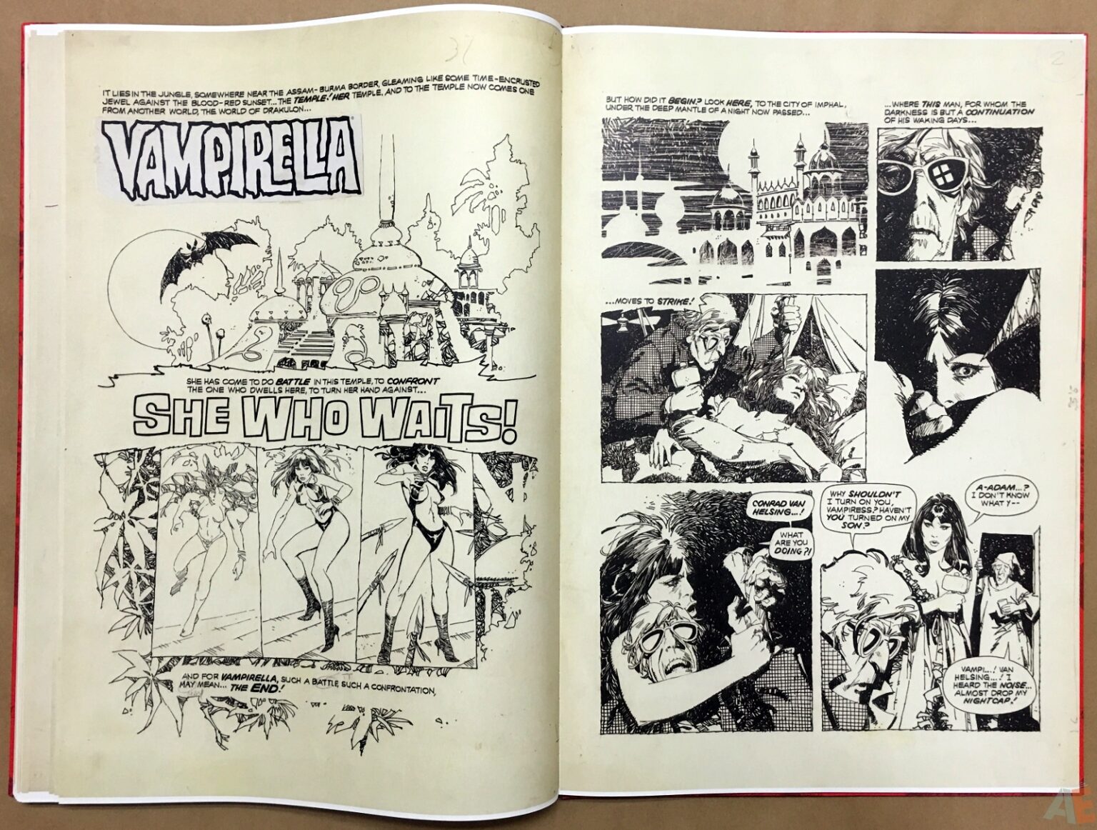
Jose Gonzales Vampirella Art Edition—this thing is gigantic!


The book came in today in a gigantic box. I was confused about what it could be, until I realized it must be the Vampirella book. I knew it was big, but this was ridiculous!! Inside the box was a somewhat smaller box packed in with crumpled paper, and inside that the book. It's way bigger than I imagined!! I'm posting Earl Grey's video about it at the top partly so people (if anybody ever stumbles across this page again) can see what a massive tome it is. 

It's a real logistics problem figuring out how to look at it. I settled on supporting it on my thighs and holding it upright with both hands. I have to lean back a bit to be able to take in the full spread. But damn, this thing is gorgeous!! It didn't feel like I was holding a book on my lap, but like I was inside it, and it might close and crush me at any moment. 

The intro tells the story about that fateful day when a certain Spaniard named Josep Toutain walked into Jim Warren's office carrying a large portfolio loaded with the work of the artists of his agency, called Selecciones Illustradas (usually just abbreviated SI).

To set the stage, Warren publishing had been struggling for a while. I believe it was the end of the 60's or the early 70s, and times were tough. They were reduced to publishing mostly reprints of older material rather than commissioning new stories. Jim and his friend Forest Ackerman, who had created Famous Monsters of Filmland for him, their first magazine, had recently seen the movie Barbarella, and they decided it would be a good idea to create a new magazine and a new host for it, a sexy and beautiful vampire named Vampirella. They had already published a couple of issues, but there were problems. Ackerman had written I believe the first issue, and an artist named Tom Sutton had drawn the lead story. It wasn't quite what Warren had in mind, it was too campy and silly, and the art was comical. He wanted something much more elegant and dark, with a sort of Hammer Horror feel to it. 

Well, exactly what he was looking for had just come in the door, but he didn't know it. Jim was hungry and about to leave the office for lunch when this brash Spaniard walked in clutching his portfolio and announced himself. Jim almost brushed him off, but the guy was a good talker, and in moments had captured his attention with his story. 

Toutain was the creator of the agency, and had a number of incredible Spanish artists working for him. He was already selling their work to publications in France and the UK, but wanted to expand into America. He had already tried Marvel and DC comics. Jim asked it either had shown any interest, and Toutain cannily said they hadn't decided yet, but he had high hopes. Then he opened the portfolio. 


Apparently the first artist represented was Jose Gonzales, and he was exactly the illustrator Warren needed for Vampirella. He knew it immediately. And as he looked through the other artists, he began to realize these guys were all perfect for large format black and white horror comics. It was as if they had been born for it. 

At the time the artists were mostly if not all American, and not very well suited to drawing horror comics. Several of them were really cartoonists, and the rest were mostly superhero artists. But here was a group of amazing artists (illustrators really) with that undeniable European elegance and style that he needed. Jim forgot about lunch and started making plans. He essentially replaced all his artists with the Spaniards whose work was in that portfolio. They all remained in Spain, working at the SI office, and shipped their work by air mail. 

Thursday, April 20, 2023

Richard Corben—dinosaurs, rounded forms and a claymation aesthetic


This image shows all the factors I mentioned in the title that make Corben's work great. I left one thing out though (many actually)—his amazing use of color. He was a pioneer when it came to color in comic books in the 70s. He came up with some kind of crazy way of using fax machines (I think?) to create 3-color separation plates so he could get amazing never-before-seen color work in his stories, like the cover above. He basically drew the art in black and white and then created the color separation plates by hand, and he had no way to see what the results were going to look like until it was printed. But he had such an amazing art sensibility he knew how to do it. 


Here again you see one of his favorite juxtapositions—smooth beautiful female flesh against the rugged hide and sharp teeth of a dinosaur. Sometimes it was a different kind of monster, or a rotting zombie, but always the counterpoint of youth, flawless beauty and vulnerability against something rough and terrible or putrid and corrupted. 


He was definitely influenced by those Ray Harryhausen movies of the 50s 60s and 70s with whipping reptilian tails and scaly hides and swaying serpentine necks. He loved stopmotion animation, and I believe especially claymation, or at least a certain kind of visual aesthetic you often see in clay animation, with bright colors and bulging rounded forms. But he also loved the scaly hides and other textures, things you can't do in a claymation film because the moment you grab the puppet to animate, you'd mash out all the textures and details. But in his drawings he could have all of it together at once. 

There's almost always a cartoonish, caricatured thing going on, no matter how horrific or heroic the story is, and he mastered all of it, though often it seemed like he drew some panels hastily and let things go all wonky. We forgave him, because when he got to the big important ones, he was totally zoned in and able to create those colorful, sexy artistic monstrer dreams on paper that got us through a few decades. 

Here you can see that his tendency toward bulging rounded forms covers just about everything, from muscles and certain female body parts, to hair. He would hire models to pose for photographs and then draw from the pictures, and he always tried to choose models, both male and female, with these kinds of haircuts. If not he'd draw it that way. Many of his male characters were bald, and so were a few of the females. He also had a very 70's thing for military uniforms worn casually. He also sometimes made sculptures of the heads of his main characters that he'd hold in his left hand under a light to get shading, and draw with his right hand. He often did shading in a combination of either ink and charocal or ink and pencil. I believe this one was done with ink and pencil. 


Bloodstone, in black & white and in color. Another great thing about his comics work is the cinematic qualities. His sense of timing and camera movement is impeccable. 


One of my favorites was his story Mutant World, serialized in the Warren magazine 1984. It was, like many of his, the only color story in an otherwise black & white magazine. When Corben did color, it was a major event. In fact, at one point, Warren had him doing color for many of their best artists who normally drew in black & white. It was a glorious time. It reminds me of Technicolor, which was more beautiful than the standard color film stocks when they came out in the 60's (and still to this day). It was difficult to do, required massive amounts of light, and also required a Technicolor specialist to be on set all the time to make sure everything was being done just right, but the results were aesthetically beautiful in a way that normal color film stock just never allowed. Very much liike Corben's strange beautiful comic art.

Refined Axe


Had a hell of a time with that axe, and I'm still not sure I'm going to keep it. It looks so different from everything else in the picture. Tried several variations on it, and so far this is my favorite. Man, I'll be so glad to stop working on that fiddly axe and get back on the figure and the background! Every time I do one like this it reminds me I really need to start with a finished drawing where I already worked out all the problems. Fixing it in post is a terrible option that involves endless struggling and half-assed measures. 


Tuesday, April 18, 2023

Axe


Roughed in a very tentative axe and some hand-blobs. Needs lots of refining or deleting. Also em-small-ified the Fafhrd logo so it fits in better. It was getting really hemmed in right up against everything. Needed some breathing space. 


Monday, April 17, 2023

Warren Horror Magazines and the Spanish Invasion

 I've mentioned my love of the 70's Warren horror comics a few times and posted just a few teaser images. I think it's time to go into some more detail and post some nice eye-watering images. (Eye-watering? Is that even a thing? Sounds painful rather than a visual version of mouth-watering, which is what I was going for, but then that's actually pretty appropriate.) There were many more artists involved in the so-called Spanish Invasion of the late 70s—I'm only presenting the work here of my three favorites. I might show a few more at another time, and I'll definitely show some of the great cover paintings.


Meet Jose Ortiz, one of the best for my money. Such a master of the black-and-white ink work. His compositions are always innovative and perfect, and he just has a perfect knack of exactly where and how to put down the big hefty brush marks and the various types of finer lines that always served double duty. They described form or texture or energy, and were beautiful decorative marks at the same time. I think of his people as looking a bit scruffy, because he always uses those curved lines that make them look a little unkempt or rumpled. 


And then we have Luis Bermejo. He was whats known as a chameleon artist, he could draw any style he wanted to and make them all look amazing. But he was the regular artist on a strip called The Rook, which was my personal favorite. He developed a very appealing drawing style for The Rook


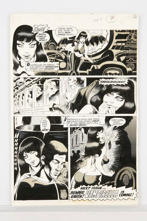
And then there's Jose Gonzales, also known as Pepe, who was the main interior artist on the Vampirella stories. 


This is one of his pencil frontispieces that would grace the inside of the front cover. 

He was often more like a fine illustrator than a comic book artist. In fact he did a lot of illustration work. All of these guys did. Really they were illustrators working in horror comics. 


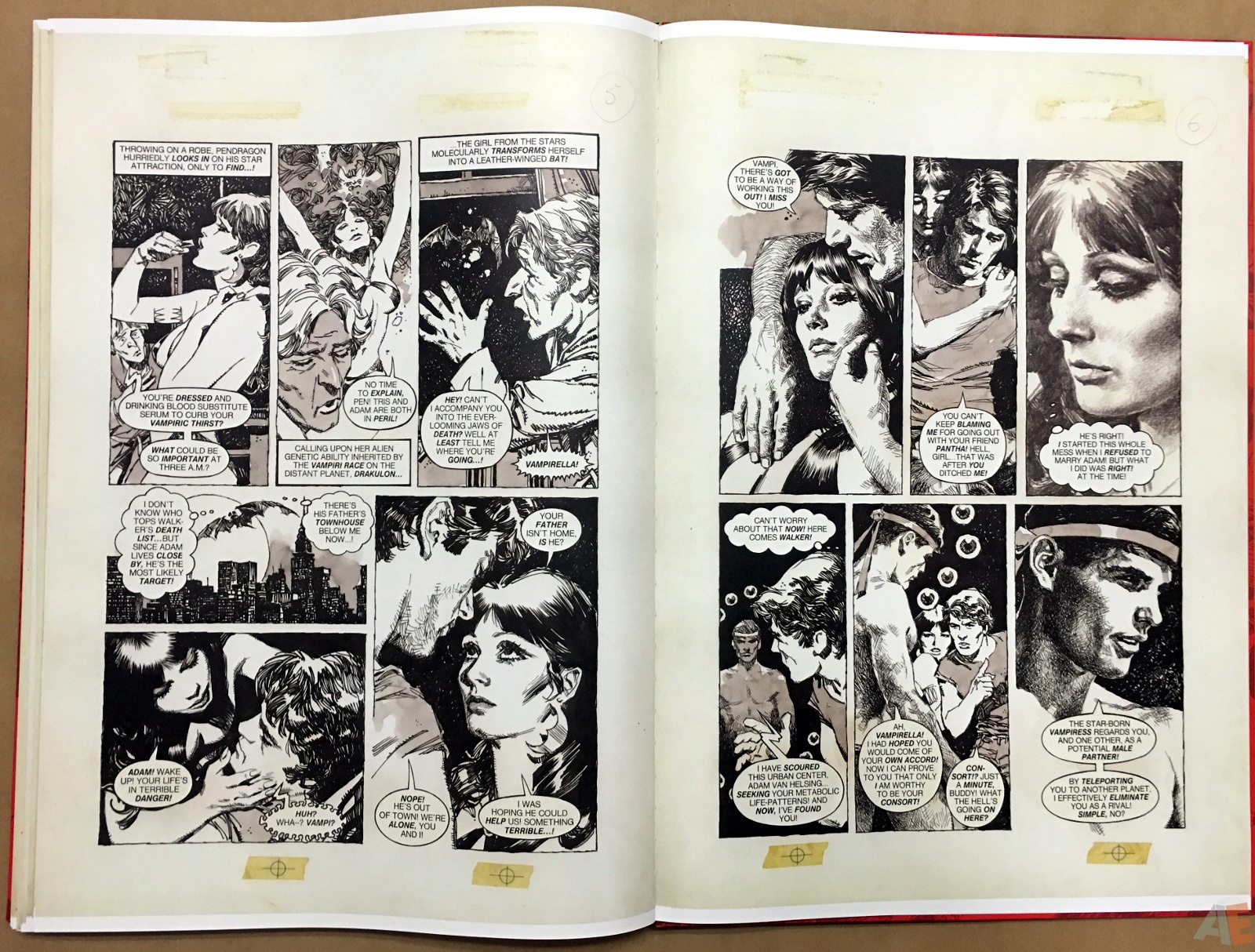
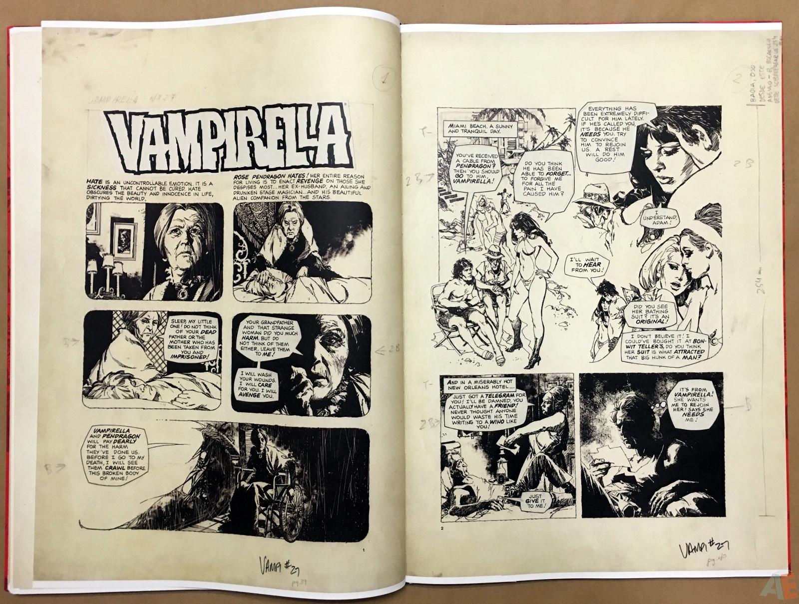
I'm not sure what's going on here, it seems to be a jam between several different artists. Or it could be Gonzales showing off his insane talents and playing with different styles? Not sure. This must be a spread from the Jose Gonzales Vampirella Artist's Edition I didn't know existed until I started searching for images to post here. I now have one winging its way to me. It's massive—22 inches tall! They make these things as close as possible to the actual size they were drawn at, on a paper as close as possible to the kind the artist drew it on, so it's the next best thing to having the original art at a fraction of the price. You can see all the markings on the page that would be cleaned up before printing, and areas where he used white-out or pasted in a new panel on top of a failed attempt. Though I don't think Gonzales ever messed up a panel. 

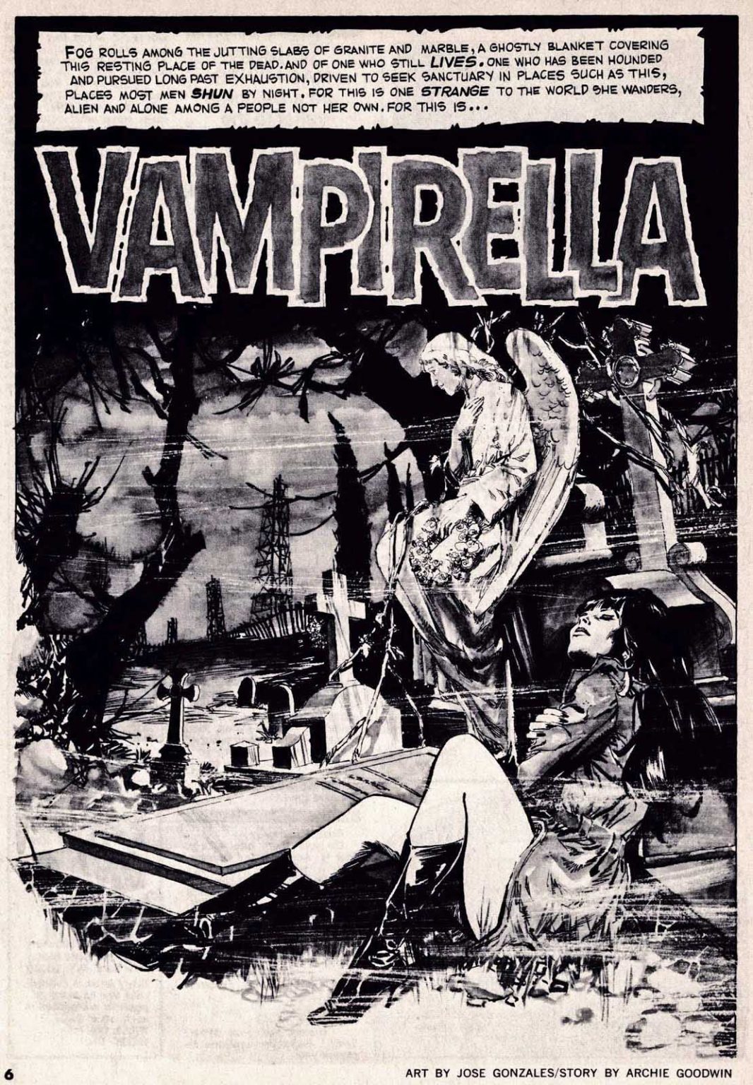
I've noticed the same dynamics going on with these three artist as I have with beautiful women. From time to time I say one or another is my favorite, but then as soon as I'm looking at another one, that one becomes my favorite. Beyond a certain level (and all of these artists are way above it) they're all favorites, it just depends which one you're looking at. The physical presence of one exerts a powerful gravitational attraction that makes you forget about all the others. Here's some more Gonzales to feast your eyes on:


Here he's using some of the special drawing techniques these guys used to create atmosphere and texture and just make everything look incredible. Looks like up in the left hand corner he put down a blob of ink and blew it around with a straw to make a tree. Maybe. And I can't tell if he scraped lines in with a razor blade or scumbled some white ink over the drawing to get those semi-horizontal effects. More on that stuff in a bit, by somebody who was there in the studio with these guys (in Spain) and watched them work. 


Here he's cycling through some of his many styles and techniques, showing off again.

I'm going to drop in some words from a guy named Diego Cordoba, who commented under a few issues of the Creepy, Eerie and Vampirella Archive Editions several years ago, when they were being printed. I had long been a fan of these legendary comics, and always wanted to know more about the mysterious artists who created them, but the info was impossible to come by, until I ran across these comments. Enlightenment began to dawn.


Eerie, the monster serials & the Spanish artists, December 13, 2012
Diego Cordoba, from a comment under Eerie Archives Volume 11 (Hardcover)

"Many American fans then and now, wondered why Warren had opted to have all those Spanish artists. The first answer that came to mind, was that they were actually Mexicans from south of the border who were getting paid minimum wage rates to slave for Warren. But truth of the matter was that Warren actually paid the highest rates at the time, no matter where the artists came from (a practice both DC and Marvel didn't apply to the Filipino artists who were getting a third of what the Americans were paid). Warren's reasoning was quite simple: the Spanish artists were good! But what made these Spanish artists so good? What many people don't know is that most of these guys started working pretty young, mostly in their teens. And as they worked among already seasoned professionals, by the time they reached their early twenties, they were already seasoned professionals as well, something most of their American contemporaries weren't because they had only just started working in the business. You can see this in some of the earlier Warren archive volumes, were the artwork done by some young American artists is quite mediocre by comparison. And even if most of the Spaniards were only in their mid-twenties to early thirties when they started working for Warren, they already had more than a dozen years of experience, which made them seem so much better that their American counterparts.

"The Spaniards also had a very peculiar way of drawing or inking their comics, that didn't resemble anything done in America at the time. They were also masters of working in black and white, and this was due to the fact that they worked mostly for British magazines that were only printed in B&W. They also got their peculiar style of inking from some Italian magazine of the 60's called Linus. That magazine, which got its name from a Peanuts character, featured the art of two masters of b&w inking and drawing; the Italian Dino Battaglia and the Argentine (though born in Uruguay) Alberto Breccia. Both Breccia and Battaglia had worked for the same editor in Argentina, who also happened to be the best comic book writer of all time: Hector German Oesterheld. Oesterheld got into comic books by accident, and would be among the first writers who would write specifically for an artist (pretty much like Kurtzman and Feldstein would do in EC), and a practice that the Warren writers would also follow. You can imagine the Warren writers fighting to get Maroto or Luis Garcia to draw their stories... 

"Alberto Breccia, the argentine artist who would inspire so many of the Spanish artists in the late 60's/early 70's, would develop his very peculiar style of inking pretty much through trial and error, and a part of genius as well. Cutting himself one morning while shaving, he pulled the razor blade out and when he was about to leave it on the sink, he noticed it left behind a series of trails pretty much like the lines he obtained while inking with a pen. This gave him the idea to use a razor blade not only to ink, but to scratch the board and so obtain different effects on his inking. This wouldn't go unnoticed among the Spaniards, who began scratching their boards with a razor blade to extreme effects (look at Auraleon's artwork to see what I mean). Breccia's extreme use of shading and shadows, leaving only slits of white on the board to give more depth to his drawings, would also be of a great inspiration to the Spaniards. Most of them discovered Breccia's work either from the same British weeklies they were all working for, or from the afore-mentioned Italian magazine. Frequent Vampirella contributor Fernando Fernandez had also lived for a couple of years in Argentina, and when he came back to Spain, he showed all his friends at SI Artists (the art studio they all worked for in Barcelona), some of the astonishing art he had found in Argentina: artists like Breccia, Jose Luis Salinas (who drew the Cisco Kid newspaper strip, and perhaps the best artist of all time along with Hal Foster), Roume and countless other Argentine artists that would inspire the Spaniards as well.

"Dino Battaglia, the other source of inspiration for the Spaniards, was an Italian comic book artist who in the early 50's worked for another Italian publisher who had moved to Argentina along with such Italian luminaries as Hugo Pratt and Alberto Ongaro. He used a very peculiar way of inking, working not only in heavy blacks, but with grays he obtained with a "souffle-au-cul", a sort of metal tube divided in two sections; one part went inside the ink pot, and through the other you would blow as through a peashooter. Blowing through one of the metal tubes, would cause the ink to rise through the other tube, thus obtaining an ink splattering on the surface you blew onto. This splattering, similar to what an airbrush does, but much more coarser, and depending on the force with which you blew, would appear almost gray in print. This method of graying was very much appreciated by the Spaniards, who didn't know how Battaglia obtained this effect. However, they soon discovered that by dipping a used toothbrush in ink, and then rubbing the bristles with a ruler onto their art boards, they could obtain a splattering effect. Another trick was using an old sock dipped in ink, and then applying it onto the paper. You would obtain a splatter-like effect as well. As soon as this was discovered, all the Spanish artists were either dipping their toothbrushes, socks, or any clothing with a coarse weaving, into their ink pots and applying/or rubbing them onto their art boards. These effects are used by almost the totality of the Spaniards in the late 60's/early 70's, and you can pretty much see it in all the stories they did for Warren. Add to that some scratching with a razor blade over the splatter you obtained with your socks, toothbrushes, etc., and you've got all the shading needed for a Spanish-like inking for a Warren story.

"Though inspired by both Battaglia and Breccia, the Spaniards came up with a hybrid-style all their own, which however wouldn't last beyond the decade of the 70's, as nobody works that way anymore.

"Nevertheless, back in the day, the importance of the Spanish artists didn't go unnoticed among the other artists working for Warren, as many of the non-Spanish artists were trying to emulate them too. You can see this with Paul Neary's work on "Hunter," where he tries to copy Maroto's style, and even with some stories drawn by Tom Sutton. Of special note is also Gonzalo Mayo's work, who many believe is Spanish, but is among the only two Peruvian comic artist to ever make it in America (the other one being Pablo Marcos). Mayo's work is very similar to Esteban Maroto's. And Maroto, whether you like him or not, has left an indelible mark on comic books, with his neo-classic, Mucha-influenced style of drawing.

"Maroto's series "Dax the warrior", by the way, was meant for Vampirella (see my review for Vampirella Archives volume 5 for further info)."


New characters, new changes, December 9, 2012
Diego Cordoba, from a comment under Vampirella Archives Volume 5 HC (Hardcover)

Vampirella had the chance of finding its most iconic artist as soon as the Spanish artists took over, in the person of Pepe Gonzalez. Gonzalez was an anomaly among comic book artists because he had never wanted to be one in the first place, and as a kid had never read comic books, and only got to do them by a fortuitous accident. Being a very able artist, he was hired at age fifteen to draw comic books by a fresh and newly formed art agency in Barcelona. Like most of the other artists in the studio, they worked for the European, and mostly for the British market, drawing anything from war, spy and western stories for various publishers. It wasn't until Gonzalez, or Pepe, as everyone in the agency called him, was given a western story featuring some can can dancers to draw, that they discovered he could actually draw very beautiful girls. It got to the point where every other artist in the agency would copy Pepe's girls, as he seemed to have the knack to draw them very pretty and appealing. Shortly after, he was given the assignment of drawing romance stories instead for the british market, something he preferred anyway to drawing cowboys. So it wasn't surprising that Pepe was given the chance to draw Vampirella, before any of the other artists from the Barcelona art agency. And this he did extremely well, so much that it's difficult to this day to think of another artist who better defined the look of Vampi. 
 
The problem with Pepe was that he cared very little for comic books, preferring instead to do illustrations in pencil (something he would eventually do for Warren as well, and his pencil drawings of Vampirella are breath-taking). He hardly ever pencilled his pages, the only pencilling he'd do were a series of circles to know where he would place the characters, and then he'd draw the pictures directly with a sharpie. This method however had the drawback of leaving many disproportions in the bodies he drew. Also, for someone who claimed to be a homosexual, he seemed more interested in drawing beautiful girls than men; his male characters rendered quite hastily most of the time, and almost as an afterthought. Pepe also suffered from what's known in the business as being a "lazy artist". He was a really talented person, and not only as an comic book artist, but as a singer, a showman, an immitator, etc. The problem was that he never cared much for anything and didn't really apply himself to his work. Maybe because all this came so natural to him, he never thought of working hard at anything, and just picked the easy way out. Though among his many talents the one he said he could easily desist of, was drawing comic books. Strange, as he made a living from drawing comic books. After his stint on Vampirella, with which he pretty much stuck with until the very end of the company, he would create a couple of other series, always featuring a female lead character. He sadly passed away in 2009, having lived most of his life in the company of his mother and grandmother.

There's one more thing I want to post here, besides a collection of the amazing Warren cover paintings, and that's a brief account of how these mostly Spanish artists came to work for an American company and basically replaced all the American artists who had been illustrating the magazines. I'll dig up the info aand get it ready for when I make that post. 


Getting There