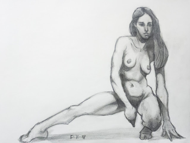
Friday, June 29, 2018

Bodies and Heads...


After doing a couple of figures (which are separate drawings - I laughed when I saw what they look like together!) I decided it's time to start on heads. Started by just seeing what I can do from imagination. WTH -- I know I can do better than that!!! Looks like the way I used to draw a long time ago...


So I slowed down and put a lot more thought into it. Is it just me or is there something of Willem Dafoe in that first one? The second is done from a frame of the first X-Men movie. I can see I made the features too small for the head, and the shadow area needs some work. So I pulled up some of the screengrabs I snapped of the David Finch course on Gnomon. I took advantage of their 3 day free trial and watched all 4 of his videos, plus filled a folder with screenshots so I can draw from them.


Also did a couple from my Asaro head...


The Finch-style comic book heads seem to use a combination of certain elements from the Loomis head method, Reilly Abstractions, and maybe a bit of the Asaro head? Though I believe John Asaro based it on both of the above, if I remember right. So they're already sort of mixed in with each other to a large extent. They go together well.


Monday, June 25, 2018

Rough notes explaining the Levels of Complexity

These seem to be the levels of complexity in a piece of art - beginning with simple 2 dimensional shapes to the 3D projections of those shapes into forms, then combining modified forms to create figures and posing them to suggest a particular action. Then by combining multiple figures interactively you suggest a bigger action and the beginnings of story. Other elements in the composition also add to the idea of story.

I don’t mean to suggest that there’s some inflexible hierarchy that goes in this specific order all the time, it’s more flexible than that and really these things combine with each other in various ways at every level along the way. You might begin thinking about composition for instance before you completely work out the poses and interaction of figures. They all develop differently. 

I just listed the terms in this particular order because it does seem to represent increasing levels of complexity from the basic elements (shapes) all the way to the overarching idea of a story, which is hinted at partially by the piece. 

Each leveling-up along the hierarchy is a move from one state to the next in the creation of a piece of art. The ultimate end goal being an image representing a story, with characters engaging each other in some dramatic way. Well ok not always - could be just a character portrait but even then many of these levels still apply, and the secondary character being engaged with might be the viewer.

Example - if you start with a shape - let’s say you draw a rectangle. Project that from 2 dimensions into 3 - visually extrude it up from the surface of the paper and you end up with a block - a form rather than a shape. So it’s a step up in complexity to the next level (3 dimensions rather than 2), and it creates greater complexity, but never in a random way. It’s always very definite and with the end goal in mind. In other words, it’s an evolution toward the ultimate goal, not just added random complexity. 

To illustrate this with an example, let’s say you have a form - not just a rectangular block but a modified one that looks like a ribcage. Add some more modified basic forms to it. Depending on how you do this, you can end up with a meaningless jumble of forms that resembles a junkyard, or you could end up with something that looks a lot like a human body. 

But at this stage - the shift from form to figure, you need to do more than just make sure it resembles a human (or animal) body. It needs to be posed to suggest a definite action, which suggests some part of a story. And if this is a Heroic Fantasy painting or a panel in a comic book or some other type of art involving conflict, there’s also interaction, meaning the action of this character is in opposition to the counter-action of whoever it’s engaging with. 
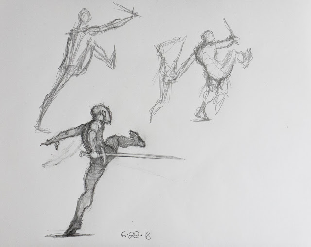
So in the beginning you start with some idea of a story, and you choose a conflict from it (for this example I’m thinking strictly about sword fighting). The way I tend to work is to start from this basic point (at least a vague idea of an overarching story and a more firm idea of the specific conflict I’m depicting). And I try to visualize the pose of my main character, or maybe the secondary one. Or possibly both at the same time, though that can be a lot harder (sometimes it just pops into your head all at once). In the example of my Mouser above, I was reacting to the set of drawings I had already done with him doing a fencing lunge, where he ended up apparently jabbing at his opponent’s knees (need to angle the arm and sword upward to correct that). I wanted to do something less like formal fencing and more dramatic. I also wanted to include some type of grappling or punching or kicking, which makes it a lot more dramatic and personal than just clanging swords together. Street fighting while holding swords is pretty intense stuff! 

So I came up with the idea that he would be kicking his opponent in the chest, and at first I thought he should be holding his sword up to block a downswing from the opponent, but that straight arm looked really awkward (as did the straight legs and back-leaning torso). I doodled randomly a bit trying to find a way to get some nice curving gesture in and make it look more graceful, and after a couple of attempts (in which I demonstrate my tendency to scratch around a lot when I don’t understand what I’m drawing clearly) the pose resolved itself. The moment of clarity hit when I suddenly understood the pelvis needs to be in line with his legs - as soon as I sketched that in everything else began to quickly fall into place. 

What it means is, the pose needs to represent some kind of coordinated action - not just aimlessness. When his pelvis was at a 90 degree angle to the line of his legs, it worked against the forward action, but when I brought it into alignment, the forward thrust through the legs into the opponent’s (as yet invisible) chest became palpable and powerful, and the pose took on some kind of life. 

This is what you’re looking for at each stage - you’re moving to a new level of expression and it should bring a new sense of liveliness or life (need to find better words for it) or drama. It needs to increase the drama, not detract from it. 

Keep in mind, the order in which I listed the stages is only the order of complexity of them - not the order you move through. For example, in drawing this figure I began by thinking in loose general terms of a vague pose, and sketched in a sloppy gesture or stick figure suggesting some version of the pose. I had some notion of the action and interaction in mind as well, all very loosely. I made a few changes by drawing new versions, still very loose and gestural, until the idea suddenly solidified and I drew it again - this time it looked much better. As you can see though, I erased the back arm and changed it to suit the pose better (still not quite right). And though I like it, I see it needs a lot of development still. Proportioning is strange; he looks like a little boy with a big head and short skinny arms -- the farther hand is too big and the nearer one too small (should be reversed according to the rules of perspective). And that back heel needs to be down solidly on the ground. I also need to sketch in his opponent and see how they’re interacting with each other - that might suggest some further changes in the Mouser’s pose. 

Saturday, June 23, 2018

Levels of Complexity in Figure Development


Carried this one farther still using the mouse, but I think I'll let it go until I get a new tablet -- or maybe just let it go altogether. I realized what I'm doing is copying a picture, not developing this from my own mental mannikin that I've developed through my drawing of these little comic figures and quick-sketches. I'm beginning to understand that I need to work my way up from the little figures and gradually add on levels of detail. And by detail of course I don't mean pointless stuff that detracts from the main focus, but the increasing levels of complexity that you see as you get closer to a person - in the small figures you're seeing what you would see from across the street or even farther - just a simple body shape. Almost just a silhouette.  But when you put in more time and do more developed drawings you add levels of increasing detail - each limb takes on a bit more structure and form, and then at the level of a portrait or a waist up shot you get the full level of detail.


So I drew these yet again. I'm not sure it's particularly helpful though to keep doing the same drawings over and over - but it was by way of a warmup before doing a few posed figures from imagination below. Wanted to brush up and get myself thinking in figurative format - it's been a few days since I drew any of these and I felt like I had lost any progress I made. So I brushed up.


And I decided not to make pretty drawings, as I did at one point recently in copying these images (from How to Draw Comics the Marvel Way). Making pretty drawings hinders the process of developing an idea, because you don't want to mess them up. So keep them rough but serviceable.


Begin Imagination Work:

Here I started working from imagination, developing an idea for a pose. I suddenly realized this looks a lot like some similar poses I did in brown fountain pen in the long sketchbook back in 2014.


And as I mentioned on ConceptArt yesterday when I posted these last 2 sheets, I learned that I need to start with a simple pose, usually drawn from a basic viewing angle so there's no or very little foreshortening, and limbs are posed simply -- even awkwardly sometimes. I can't work out all the complexities of a difficult pose in my head before I start drawing - need to go through a few little thumbnails to work it out stage by stage. 

Interesting - I just realized this is working through levels of complexity of the idea for the pose, just like I said at the top about the levels of complexity of the body. This seems to be the new thing I've latched onto and am thinking about all the time now. 

I won't go into detail about this just now, but I had a thought about a sort of hierarchy of levels of complexity beginning with the simplest and working through the different levels in developing an image: 

Shape, Form, Figure, Pose, Action, Composition, Story. 

You don't necessarily go through it in exactly that order - in fact you would skip around and go back and forth a bit while developing the ideas for the image.


To develop individual figures you go through Shape, Form Figure, and Pose, but the last 3 terms branch out into larger realms. The Action is about how multiple figures are interacting with each other. Composition of course is an overall pictorial device or strategy. And Story moves outside the confines of the image itself - the image is a reference to some part of the story. Shape comes in at different points - it's the 2 dimensional aspect of a Form, which can become part of a figure, or part of the composition, or of any other part of the image (such as the landscape or an object). 

I'll develop this idea a bit more and write something up about it.

Monday, June 18, 2018

Killed my tablet last night


Can't believe I did it!!! It's a bit of a complicated story, I won't lay the details on you, but just wanted to commemorate the date of my tablet's death here.


This piece was only about half done at the time, and I discovered something astonishing -- I can actually paint with a mouse now, and do some pretty decent wok that way! It's how I was working when I first dabbled in digital painting in 2004 (when I first joined ConceptArt), but back then it was like typing with boxing gloves on. Now I guess I've developed some digital dexterity, as well as a lot of knowledge of how to paint digitally.

But I can't do detail work that way, and it's pretty cumbersome. Looks like until I get a newer tablet with software that's fully compatible, I'll be working traditionally. Actually that's a good thing - I do want to do a lot of painting in gouache. And I suppose I can still go in at the end and do all the fixing and sweetening like I tend to do over my drawings and paintings before I post them.

Thursday, June 14, 2018

New Book Haul - Batman, Swamp Thing, and The Studio


It's funny, but I did not even realize all 3 of these books have Batman in them. Swamp Thing is another DC book, and often Bats will make an appearance in some of the lesser-known titles -- I suppose it boosts sales. And as for the 2 that have him on the cover, I approached the decision to buy them each for such different reasons that it didn't occur to me until after the books arrived that they both include the Caped Crusader. 

It started with the David Finch Unwrapped book - I had seen it featured on the Earl Grey youtube channel and was instantly struck by the amazing penciled artwork - and even just the idea that they are now publishing comic book pencil art! In Finch's case I fully understand why - his pencil work is a thing of beauty and deserves to be appreciated in all its glory, though it was very difficult for them to get dark enough images because he works in 4H pencil, which is very light, and it taxed the limits of the technology to bring up enough contrast.

I'm really glad I discovered Finch's work, because I'm at a point where I've got about as far as I can with digital painting, and in order to improve now I need to really push my drawing skills. This book has amped up my inspiration and excitement about it.

I've been watching a lot of comic book videos lately - especially the Comic Book Historians channel, which explores the roots of familiar comic book characters in pulp fiction, newspaper strips, and old movies. Also watching a lot about Jack Kirby, whose work I've come to appreciate more and more (originally I didn't like it). 


Here's one of Finch's knockout images from the book. One thing that makes it look so good is probably (largely anyway) an accident - it's because the edges of the shadows are dark and then they're filled in lighter, which creates a good core shadow/ bounce light effect. That's even accentuated by what he calls the Rendering -- which turns out to be the cross-hatching along the edges of the shadows. It works perfectly as half-tone, which is a soft shading along the edges of the core shadow blending it subtlely into the light areas.  Ok, I'm sure he's well aware of these principles of lighting and shading, so they're not really accidents, but they also happen to work quite well for their intended purpose of showing the inker exactly what he needs to do. 

I love that Finch cares enough to (often, not always) go ahead and fill in the shading, whereas most pencilers will leave the black areas empty and indicate them with little x's for the inker to fill in. The penciled art looks better in a way than the finished inks, because the areas that will be solid black are filled in lightly, resulting in that bounce light effect I mentioned. That won't be there in the final product, instead those areas will be flat black. 


What made me decide to order the Jim Aparo Batman book was nostalgia. Here's a comparison of the amazing printing, on good quality paper, compared to my old comic book below, printed on pulpy newsprint that soaked up the ink and made comics look washed-out  in the 70's. Wow, what a difference! 


(Note - after seeing these pages compared, I now think the new version looks a bit too bight and cartoonish - the original desaturated look better suited the gritty street-level tone of these stories.)

I should mention though - in case this makes anybody want to get the book - aside from this story and a couple more, I was largely disappointed in the rest of the book. I had come to think of Jim Aparo as my favorite Batman artist, largely on the strength of this one story, and somehow I assumed he did a bunch of other similar stories (the other ones I posted in my Batman in the 70's writeup a while back). 

But enough about Batman...


The Studio is a book I've always dreamed of owning but never bought until now. Somehow it slipped under my radar when it was published and I didn't know it existed until it was out of print and used copies were exceedingly hard to find and expensive. I recently tracked this one down for $50 (which would have been a fortune to me back then). 

It shows the work of 4 artists who had pooled their money and rented a massive studio space in New York - namely Jeffrey Jones,  Michael Kaluta, Barry Windsor-Smith and Bernie Wrightson. Some of the best artists working in Heroic Fantasy, Horror, Sci-Fi and Fantasy at the time. I won't say any more, I'll just drop a couple of images rather randomly in here:

Jeff Jones ink & gouache sketch

Mike Kaluta illustration
To make up for not writing much about The Studio, here's a video by ETA Nick where he flips through the Jeff Jones section.

Here's his video on Barry Windsor Smith where he shows Smith's section of The Studio.

Bernie Wrightson...

Apparently he didn't do the Kaluta section, or I can't find it. 

Wednesday, June 13, 2018

Pushin' tha pencil


So much for weekly posting - if I keep drawing at this rate I'll have too much for a single post on Monday. Using something similar to the Watts-style quick-sketch techniques, but in pencil, and drawing a lot slower. As I get better at it I'll start speeding up. As Dave Sim said (and I keep quoting): "First you get good, then you get fast, then you get good and fast".

I'm not starting with a rapidly-done (and rather sloppy) gesture sketch anymore, that's what was making my older figure drawings come out all distorted. So I'm sketching it in very lightly and carefully and re-stating any parts that need it until they look right. In other words just drawing the way I used to before all this gesture stuff (though I do pay close attention to gesture as I go - I don't mean to imply that studying gesture was useless). I can see it looks a little stiff, or maybe just a little less energetic than I would like. Need to work on that going forward. One thing I'm finding is that it's hard to do core shadow technique on 9x12 paper - no wonder they do it on newsprint in charcoal! Might need to get back to doing it that way.


Re-doing these and trying to get them a lot better than before. It's definitely working. Soon I'll understand this well enough to do it with no reference (already tried a few times as seen in recent posts).


That guy in the lower left still isn't right. Next time...


Monday, June 11, 2018

Weekly posting? Tentative anyway.


Did this one in gouache, with aquarelle pencils and cray-pas, and then finished digitally. I'm actually quite surprised how well the gouache painting came out - with some practice I think I can work entirely that way. I plan to start doing exercises on small pre-cut cards of watercolor paper (this one was in the Strathmore 500 Mixed Media sketchbook) to develop skills and practice techniques. 


The rest of these are just comic figure quick-sketch. Finch made it clear that these are the key to becoming a comic book artist (not that I want to do that exactly, but I think it will help a lot toward heroic fantasy painting and similar genres). You need to do hundreds or thousands of these, in every position, from every angle, and in all kinds of perspectives and lighting conditions. It's really at this level of drawing that you make it or break it - save all the tight rendering etc for afterwards.


Of course these are pretty extreme - derived from Jack Kirby's extremely dynamic style (which is what was meant by "The Marvel Way" - it could have more rightly been called "The Kirby Way"). For painting you wouldn't do them so intensely in terms of pose and viewing angle etc, but knowing how to do that doesn't hurt. In fact I believe in developing the ability to do things beyond what you'll actually need - once you've done that it's a simple matter to ease off a bit - but if you learn to draw figures only in static standing, seated and reclining poses then you won't be able to do anything more dynamic.


Monday, June 4, 2018

Playing catch-up again


I keep using YouTube thumbs for my practice pieces. And when you do that, there's always the danger that you're working from a photoshopped image, which turns out to be the case with this pic of Hulk Hogan @ 62 - his arms are not that skinny, and I think the guy made him look fatter than he really is. I did manage to find the real image (where the Hulkster is sporting some pretty impressive guns!), but I kept mine the way it is because it's a much more striking image - the contrast between that massive chest and the stalk-like arms is funny and eye-catching. It's what grabbed my attention in the first place, as well as that really great shadow covering his abdomen area.


In no particular order these are some catchup images since the last post, plus a few more recent ones.


I decided I had got about as far as I could go just concentrating on digital painting, and I need to really get in and work on my drawing. I used to draw all the time, and I haven't for over a decade. When I would draw for my tablet paintings I was just scribbling out a hasty image, depending on being able to fix it in photoshop (never a good idea). I somehow thought I was going to develop the ability to work as well in digital as I can on paper, but that never happened, and I don't think it will.

So this is where the graphite hits the paper. A big part of my recent drawing inspiration was when I discovered a comic book artist named David Finch (who drew the Batman head I copied above).


Finch has a few drawing lessons on Gnomon - I signed up and took advantage of the 3 day trial period to watch his videos plus one by Steven Platt (Splatt as he goes by when he signs his comics). He said the absolute key to getting good is to draw hundreds of these little quick-sketch figures until you can do it blindfolded - it's at this level of resolution that you develop your skills the most, then details can be added on later. But you need to learn how to sketch out these little figures in great poses and make them flow- make them look natural and human (of course human and natural are relative terms, especially in comic book drawing). Some of his looked vaguely familiar, so I dug out my copy of How to Draw Comics the Marvel Way, and sure enough - there they are! Makes sense, since he's drawn for both Marvel and DC.


Besides the little comic book quick-sketch figures, I'm also doing some longer figure drawings from photo ref.


And studying after some of the masters, like Frazetta. Here I copied his figures from a John Carter painting in comic-book quick-sketch style and added his shadows, both on the figures and the ground, which is what ties it all together into a tight grouping and grounds the figures nicely.